
Why even a five-page Quick Reference Guide can protect your brand, prevent costly mistakes and make everyone’s job easier.
Developing a professional brand identity requires considerable thought, technical expertise and creative investment.
Making sure that identity is used correctly across your business requires something equally important: clear brand guidelines.
Yet this is one part of brand identity development that businesses frequently overlook or underestimate.
Once approved, your logo and visual identity will be used by marketing teams, administrative staff, digital developers, printers, signage manufacturers, merchandise suppliers and external agencies.
Every one of them makes decisions that influence how your brand is presented.
Without clear guidance, even a carefully developed identity can gradually become inconsistent.
And protecting it doesn’t necessarily require a 100-page brand manual.
Sometimes, five carefully considered pages can make an enormous difference.
At Font & Swatch, we’ve previously explored why brand guidelines are essential to maintaining brand clarity, consistency and trust.
But there’s another important question.
How do you make sure your brand guidelines actually work for the people using them?
Because a beautifully designed brand identity is only as effective as its everyday application.
From Brand Strategy to Everyday Reality
Powerful brands start with strong foundations.
Your positioning, purpose, values, personality and visual identity should work together to create a clear, recognisable brand that people understand and remember.
These foundations inform how your business presents itself, communicates its value and engages its audience.
But there’s a practical side to branding that businesses sometimes overlook.
Not everyone responsible for applying your identity has a design background. Nor should they need one.
What they do need is clear guidance.
Brand guidelines translate your identity into documented standards that people can follow. Depending on their scope, these may cover everything from brand strategy and tone of voice to specific rules governing logo reproduction, typography, colour and visual applications.
A Quick Reference Guide concentrates on the essential visual rules needed for everyday use.
The aim is simple: less interpretation, fewer mistakes and greater consistency across your brand.
No Brand Guidelines? Everyone Becomes a Designer.
When a brand identity is first presented, everything looks exactly as intended.
The logo is perfectly proportioned. The colours are accurate. The typography works beautifully. Every element has been considered.
Then the identity enters the real world.
Someone needs to create a presentation. A supplier is producing embroidered uniforms. A developer requires a logo for a mobile application. An advertising agency is preparing a campaign.
Without established guidelines, each person makes their own judgement about what looks right.
And that’s when the little compromises begin.
One supplier adjusts the logo proportions. Another substitutes a typeface. Someone introduces an unofficial colour because it looks close enough.
Consider the complexity of a major sporting organisation working across apparel, merchandise, sponsorship, advertising, event signage and digital communications.
Its identity might be handled by dozens of suppliers, sometimes across different countries and production methods.
The consequences of inconsistent artwork can extend well beyond appearance.
Incorrect specifications can mean expensive reprints, delayed production, unnecessary approval rounds and additional design costs.
And there’s another consideration.
Every inconsistent application is a missed opportunity to reinforce the visual characteristics that make your brand recognisable.
For businesses investing in professional brand identity development, that’s worth protecting.
Brand Consistency Doesn’t Mean Everything Looks Identical.
One concern we occasionally encounter is that brand guidelines might restrict creativity.
They shouldn’t.
A strong brand identity is a flexible visual system, not a collection of rigid templates.
The objective is to establish which elements should remain consistent and where creative flexibility is appropriate.
Take your logo.
Your primary logo might look excellent on corporate stationery but be completely unsuitable as a small social media icon.
A horizontal configuration may work better on signage. A simplified symbol may be required for merchandise. A single-colour version might be essential for embroidery, while a reverse-colour logo may be better suited to a dark background.
These aren’t inconsistencies.
They’re intentional variations developed to preserve the identity across different applications.
The same principle applies to typography, colour, photography and supporting graphic elements.
Designers should have the flexibility to create distinctive communications without constantly reinventing the brand.
Good guidelines establish those boundaries.
They make it easier to create engaging work while maintaining a recognisable identity.
The Technical Details That Can Save You Money
This is where professionally developed brand guidelines demonstrate their practical value.
Let’s look at colour.
A corporate red might appear vibrant on screen but reproduce quite differently on uncoated paper, embroidered apparel or large-format signage.
Why?
Because digital screens, printing inks, materials, finishes and manufacturing processes reproduce colour differently.
A professional brand guideline should provide the relevant specifications, including HEX, RGB, CMYK and Pantone (PMS) or other spot-colour references where required.
Colour consistency becomes particularly important when a brand is reproduced across different materials and production methods. As Pantone explains in its guide to colour spaces, different colour systems serve different purposes. Understanding these differences helps maintain the integrity of a brand’s visual identity. Each has a particular application.
HEX and RGB are commonly used for digital environments. CMYK is used in process printing, while spot colours can provide additional control for certain production requirements.
Even with accurate specifications, colour reproduction may still require physical proofs, testing and production-specific adjustments.
Typography deserves equal consideration.
Which typefaces are approved? What weights should be used? How should headings and body copy relate to each other?
What happens when staff don’t have access to the corporate font?
Approved alternatives, licensing considerations, typographic hierarchy and readability requirements should all be addressed where relevant.
Then there are logo specifications.
Minimum reproduction sizes. Clear-space requirements. Colour variations. Acceptable backgrounds. Incorrect applications.
And let’s not forget the technical artwork.
An SVG may be appropriate for a website, while a printer might require an EPS or print-ready PDF. A PNG could be perfectly suitable for an internal presentation but completely inappropriate for large-format production.
The correct artwork, in the correct format, with the correct specifications.
It sounds straightforward.
But getting these details right can prevent a surprising amount of unnecessary expense and frustration.
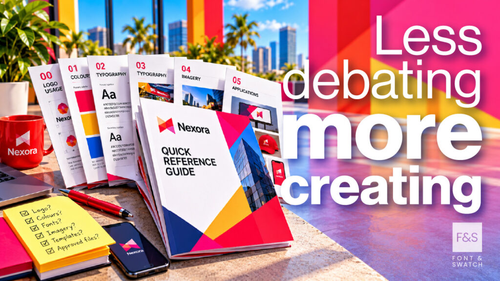
A Five-Page Brand Guide Could Save Hundreds of Decisions.
When businesses hear the term brand guidelines, they sometimes imagine an enormous document filled with technical diagrams, complicated instructions and examples of what not to do.
Those documents certainly have their place.
But does every business really need one?
Absolutely not.
A business with a website, stationery and occasional marketing activities has very different requirements from an international sporting organisation managing multiple events, sponsors, licensees and commercial partners.
The question isn’t how many pages your guidelines should contain.
It’s how much information your people need to use your brand correctly.
There are four practical levels worth considering.
Level 1: Quick Reference Guide (QRG)
A few pages. The essential rules. Immediate practical value.
A Quick Reference Guide is often the most economical and useful starting point.
Typically only a few pages long, it provides the information needed for routine brand applications.
This generally includes:
- Approved primary and secondary logo versions, including colour variations.
- Minimum logo sizes, clear-space requirements and incorrect usage examples.
- Official brand colours and relevant technical specifications.
- Approved typography, including supporting typefaces and alternatives.
- Directions for accessing master artwork and obtaining clarification.
For many businesses, a well-developed QRG answers the questions that arise every week.
Which logo goes on a dark background? What’s our correct corporate blue? Can we use this alternative font?
No searching through old emails. No guessing.
Just clear, practical answers.
Level 2: Essential Brand Guidelines
More people using your brand? More guidance becomes valuable.
As an organisation grows, its visual identity usually needs to work across more applications.
Essential Brand Guidelines expand on the fundamentals by documenting how identity elements work together.
This can include typographic hierarchy, supporting colour combinations, photographic styles, illustration, graphic devices and general layout principles.
Practical examples demonstrate how the identity should appear across presentations, advertising, stationery and social media.
For organisations with internal marketing teams or regular external suppliers, this additional guidance can reduce routine approval requests and improve consistency.
Level 3: Comprehensive Brand Identity Guidelines
For brands working across multiple platforms, products and environments.
Comprehensive guidelines document the broader visual identity system.
These may include logo architecture, grid systems, typography, colour relationships, photography, illustration, iconography, motion graphics, digital interfaces and environmental applications.
They can also address specialised requirements such as co-branding, sponsorship, merchandise, event graphics, accessibility and campaign variations.
At this level, brand guidelines become a working design system.
They provide the technical and creative direction needed to develop new applications without reconsidering every decision from scratch.
Level 4: Brand Bible or Living Brand System
For organisations managing complexity at scale.
Large businesses, multinational organisations and international sporting events often require documentation extending beyond visual identity.
This may include brand strategy, architecture, messaging, tone of voice, naming conventions, sub-brands, regional variations, partnerships and approval processes.
For these organisations, a static PDF may no longer be the most practical solution.
An online brand portal or digital design system can provide centralised access to current artwork, templates, specifications and instructions.
Importantly, these resources can be updated as the organisation evolves.
The best brand guideline isn’t necessarily the biggest.
It’s the one people can access, understand and actually use.
Brand Guidelines Should Evolve With Your Business
Your business won’t remain exactly the same. Neither should your brand documentation.
As we discussed in our earlier article, brand guidelines need to remain relevant as organisations grow and markets evolve.
But evolution doesn’t mean constantly changing your identity.
It means making considered adjustments when circumstances require them.
A business might begin with a simple QRG and progressively expand its guidelines as new products, communications channels or operational requirements emerge.
Existing guidelines should also be reviewed when new applications expose limitations, brand assets change or suppliers require additional technical direction.
The essential rules remain clear, while the documentation develops to support new requirements.
Just as importantly, everyone should be working from the current approved version.
Even the most comprehensive brand manual has limited value if it’s sitting unopened on a server or circulating in outdated versions.
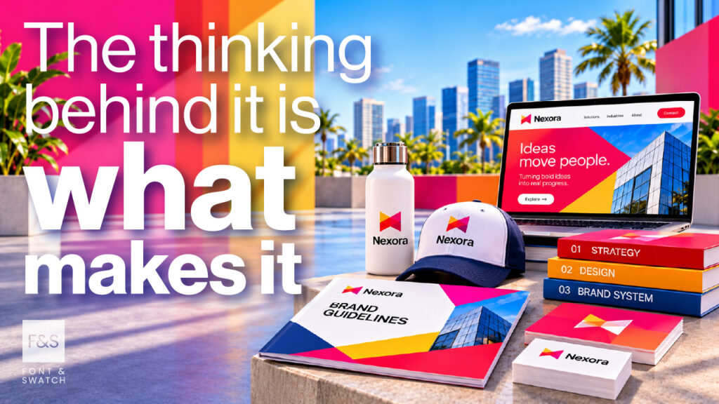
A Brand Guideline Is Only as Good as the Thinking Behind It.
Anyone with suitable software can place a logo, a handful of colour swatches and some font names into a document.
But assembling information and developing a genuinely useful brand system are two different things.
This is where professional brand identity experience becomes valuable.
An experienced design studio considers how an identity will perform in real situations.
Will the logo reproduce clearly at small sizes? Can it be embroidered or engraved? Will the typography work across everyday corporate documents? Are the colour specifications practical for the intended production methods?
These questions should be considered during brand development, not discovered after the artwork has been delivered.
For existing brands, the process might begin with an audit.
Different logo variations may have accumulated. Unofficial colours or typefaces might have been introduced. Certain graphic elements may have become familiar to customers without ever being documented.
The solution isn’t necessarily a complete rebrand.
Sometimes, rationalising existing artwork, correcting technical issues and introducing clearer usage rules can substantially improve the way an identity performs.
At Font & Swatch Branding Agency Sydney, we approach brand guidelines as part of the foundations behind a powerful brand identity.
Our experience across corporate branding, global sport, merchandise and visual communication means we understand the practical challenges that arise when an identity needs to work across different materials, environments and audiences.
The objective isn’t to produce the most impressive-looking manual.
It’s to provide the right guidance for the business.
Strong Brand Foundations Deserve to Be Protected.
A professionally developed identity represents a considerable investment in your business.
But its long-term effectiveness depends on how consistently and intelligently it’s applied.
Brand guidelines connect the original creative thinking with the hundreds of practical decisions that follow.
They reduce avoidable mistakes, support production efficiency, preserve important design knowledge and give employees, agencies and suppliers the confidence to use your brand correctly.
And when people have the right guidance, they can spend less time second-guessing and more time creating work that strengthens the brand.
At Font & Swatch, we create powerful brand identities and the technical foundations that help businesses maintain their integrity as they grow.
Because creating a strong identity is only part of the job.
Making sure it continues to work is equally important.
Sometimes that requires a comprehensive brand system. Sometimes five carefully considered pages are enough.
The important thing is getting the thinking right.
Are your brand guidelines protecting your investment, or is everyone still making their own rules?
Talk to Font & Swatch about developing practical brand guidelines that protect your identity and support your business as it grows.
