Did you know that Gotham Font is the font that got Barrack Obama elected?
Gotham Font was first designed for GQ in 2000 and was released for public use in 2002. Since then, Gotham Font has adorned brands such as Spotify, Taco Bell, Twitter, Eurovision and even appeared on Coke bottles. This multifaceted font is perfect for brands that want to portray professionalism, straightforwardness and sophistication.
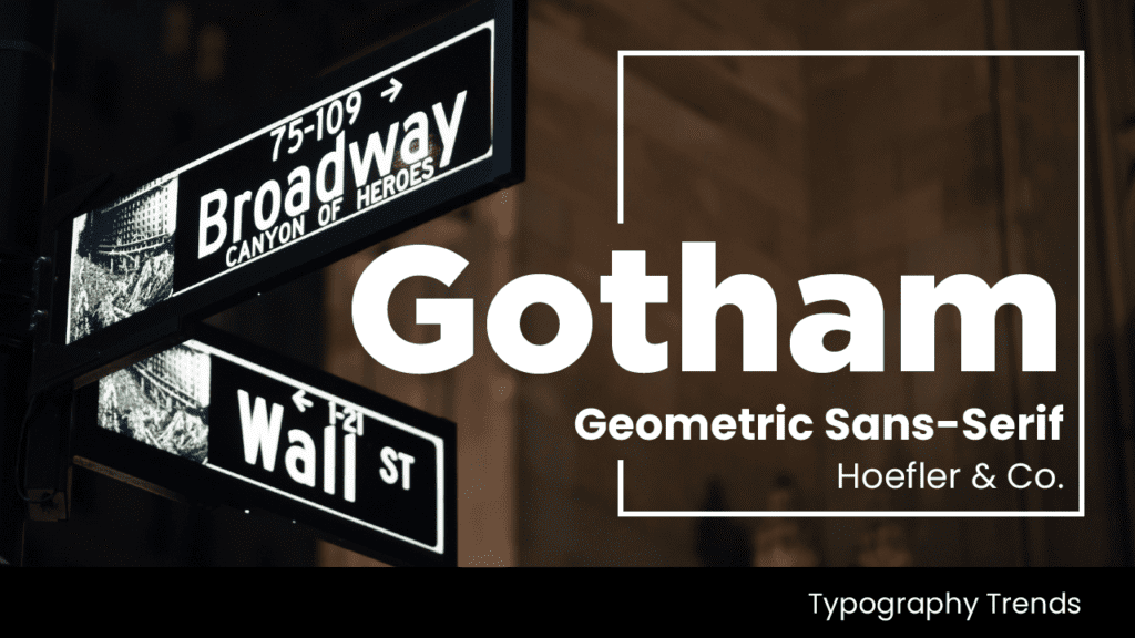
Gotham is a geometric sans-serif font family designed by American type designer Tobias Frere-Jones with Jesse Ragan and released through the Hoefler & Frere-Jones foundry from 2000. Gotham Font’s letterforms were inspired by examples of architectural signs of the mid-twentieth century.
Since creation, Gotham has been highly visible due to its appearance in many notable place. This has included Barack Obama’s 2008 presidential campaign and the 2016 federal election campaign of the Australian Labor Party. The font has also been used on the cornerstone of the One World Trade Center in New York.
Developed for professional use, Gotham is an extremely large family, featuring four widths, eight weights, and separate designs for screen display and a rounded version
Fonts influence the way people engage with your brand. It’s subtle but powerful. So, how do you determine the font that best suits you?
Our team at Font and Swatch is both knowledgeable and passionate about fonts. We can help educate you in determining the best font for your brand that will evoke the feelings you want from your audiences.
