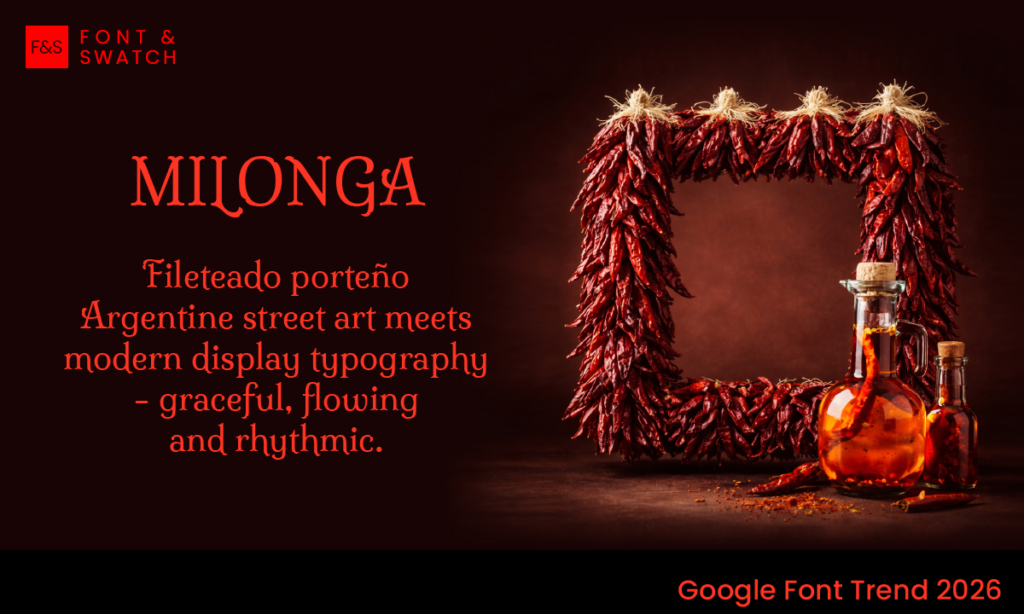
Milonga Font is a serif typeface designed by Argentinian type designer Pablo Impallari, built on the visual language of Buenos Aires. Its forms are drawn from fileteado porteño—a traditional style of hand-painted lettering and decoration once seen across buses, shopfronts, and street signage.
That origin matters. Milonga doesn’t reference classical European typography or modern digital trends. Instead, it draws from a local, highly recognisable visual culture—one shaped by craft, storytelling, and everyday life. The result is a typeface with clear structure, but with enough detail to feel distinctly human.
Milonga Font Origins and Influence
Fileteado porteño is known for its ornamentation, symmetry, and expressive detail. You see it in the curves, the flourishes, and the way letters carry movement. Milonga Font translates those characteristics into a usable type system.
Key features include:
- Petal-like terminals that soften the serif structure
- A mix of rounded and pointed elements
- Subtle decorative strokes that add rhythm without overwhelming the letterform
- Ligatures and details that reflect hand-painted origins
Importantly, Milonga Font doesn’t try to replicate hand lettering exactly. It’s been rationalised into a functional font—one that can be used consistently across digital and print applications.
What It Does Well
Milonga sits firmly in the display category. It’s not designed for paragraphs or dense reading. Its strength is in places where typography needs to carry some visual weight.
- Headlines – where the detailing can be seen and appreciated
- Brand marks – particularly for businesses with a cultural, artisanal, or heritage angle
- Packaging – where it can add character without relying on illustration
- Posters and campaigns – especially those tied to music, food, or events
It’s currently featured on over 62,000 websites and served more than 3 million times weekly via Google Fonts, which reflects its niche but consistent use in design systems that value character.
Where It Fits (and Where It Doesn’t)
Milonga Font works best when there’s room for expression. It suits:
- Hospitality brands
- Food and beverage
- Cultural or creative organisations
- Events and campaigns
Milonga Font is less suited to environments that require strict neutrality or formality—finance, legal, or highly technical industries, for example. In those contexts, the decorative elements can feel out of place.
How to Use Milonga Font Effectively
Milonga benefits from restraint. The detailing is built into the font—there’s no need to push it further.
- Use it sparingly for headings or short phrases
- Pair it with a neutral sans-serif for body copy
- Allow for spacing so the forms don’t feel crowded
- Avoid combining it with other decorative fonts
The goal is to let Milonga do its job without competing elements around it.
Font Pairings
To get the most out of Milonga, it needs a counterbalance—something clean and readable that keeps the overall system functional.
- Advent Pro – a modern sans-serif that provides clarity and contrast
- Work Sans – structured and neutral, good for digital layouts
- Noto Sans – reliable for multilingual or content-heavy applications
- Inter – particularly effective in UI or web environments
These pairings allow Milonga to handle expression, while the supporting font handles readability.
Why We Like It
At Font & Swatch Branding Agency Sydney, we look for typefaces that add something distinct without becoming difficult to use. Milonga does that well.
It brings in cultural reference and visual detail, but it’s still structured enough to work in real design systems. It’s not trying to be everything—it has a clear role, and it performs it consistently.
In a landscape dominated by clean, neutral sans-serifs, Milonga offers an alternative. Not louder—just more considered.
Final Thoughts
Milonga is a display font with a clear point of view. It’s built on a specific cultural reference and designed for specific use cases. When applied correctly, it adds depth and character without overcomplicating the design.
It won’t suit every brand—but for the right one, it’s a strong addition.
