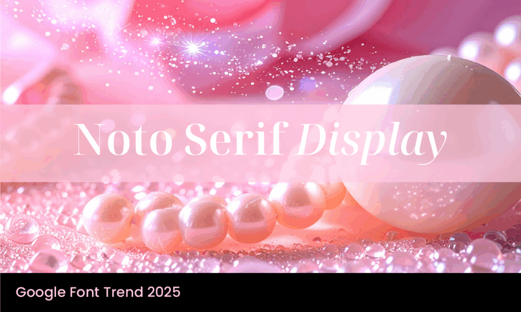
Noto Serif Display is a typeface that stands out not just for its elegant form, but for the intent behind its creation. Part of Google’s expansive Noto font project, Noto Serif Display was designed specifically for large text applications—titles, headers, and anything that needs to catch the eye and hold it.
It delivers a sophisticated and formal feel with the subtle power to command attention without being brash. In branding and communication, this makes Noto Serif Display valuable. It’s a font built for authority, but with just enough style to feel contemporary and engaging.
The Noto Font Legacy
The Noto font family, short for “No Tofu”, was born from Google’s mission to eliminate the annoying empty square boxes (commonly called tofu) that appear when a character is unsupported in a font. Noto aims to support every language and character in the Unicode standard, meaning your brand can communicate globally without typographic inconsistencies.
Within this family, Noto Serif Display represents the refined and visually rich end of the spectrum. Designed for display use, it’s not intended for body text—that role belongs to Noto Serif. Instead, Noto Serif Display excels when used in larger sizes, offering sharp detail, visual harmony, and clarity.
Design Characteristics
Noto Serif Display is a modulated serif typeface, meaning it has contrast in stroke width, a hallmark of traditional print typography. It’s structured yet decorative, classic yet versatile. The font includes multiple weights, widths, and italic styles, making it adaptable across branding applications. Other modulated serif typefaces include Garamond and Times New Roman.
It supports Latin, Greek, and Cyrillic scripts and offers more than 3,000 glyphs. This broad language and symbol support makes it particularly useful for international and multilingual branding.
From a visual standpoint, Noto Serif Display is all about balance and contrast. The strong verticals and elegantly tapered serifs give the font a sense of control and structure. At the same time, its wide stance and generous spacing provide excellent readability, even in dense headlines.
Where To Use Noto Serif Display
- Headlines and Titles
This is where the font was meant to shine. Whether it’s the homepage of a corporate site, the title page of a report, or the heading of a brochure, Noto Serif Display provides a strong visual anchor. - Brand Identity and Logos
Brands that want to communicate credibility, legacy, and sophistication will find this typeface a valuable addition to their visual toolkit. It’s especially effective in education, publishing, public institutions, and professional services. - High-Impact Print Materials
For magazine covers, posters, and signage, the font delivers legibility at a distance while maintaining a refined appearance up close. It’s the kind of font that invites the viewer to take the message seriously. - Web and UI Design
With its open-source availability and web compatibility, Noto Serif Display works well for digital branding. Use it in hero banners, navigation headers, or anywhere that needs emphasis and elegance.
Emotional Tone and Brand Personality
Noto Serif Display conveys a measured confidence. It feels traditional without being old-fashioned and polished without being overdesigned. The result is a typeface that speaks with a calm authority—an excellent fit for brands that want to express reliability, intelligence, and taste.
This emotional tone is reinforced by its ties to the broader Noto mission. Choosing Noto Serif Display subtly communicates a commitment to inclusivity, accessibility, and global reach. It’s a thoughtful font for thoughtful brands.
Font Pairings
Because of its formal tone and strong character, Noto Serif Display benefits from pairing with simpler, more neutral fonts. Try these combinations:
- Noto Sans – For a harmonious look within the same font family, especially useful for multilingual projects.
- Open Sans / Helvetica – Clean, readable sans-serifs for body text that lets Noto Serif Display stand out in headers.
- Lato – A slightly more rounded humanist sans-serif that adds warmth and approachability to the overall aesthetic.
Final Thoughts
Noto Serif Display is a smart, stylish serif font with a global mindset. It’s made for brands that need to project clarity and elegance—without sacrificing legibility or accessibility. Whether your business operates across languages or simply values a professional, polished look, this font is a reliable choice.
At Font & Swatch Branding Agency Sydney, we help businesses unlock the potential of typography to build powerful brand identities. Fonts like Noto Serif Display define a tone, character, and intent. If your next project needs a headline font that stands out with grace, Noto Serif Display could be the answer.
