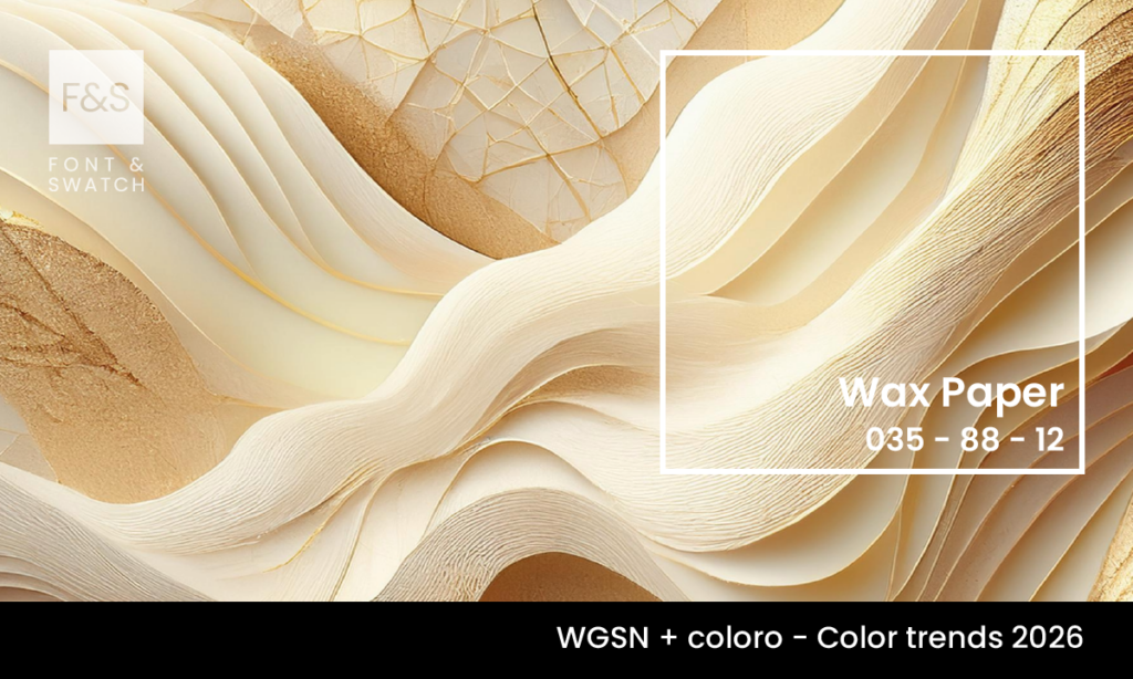
2026 is forecast to be a year for redirection, renewal, and challenging outdated systems—shifting our visual language. Colour, as always, plays a vital role in communicating what words cannot. For brands seeking to inspire calm and warmth in an age of polarity, Wax Paper (Coloro 035-88-12) is a quiet revolution.
Selected as a Key Colour for A/W 26/27 by Coloro and WGSN, Wax Paper is a creamy, off-white hue with a soft yellow undertone. It’s a near-neutral shade inspired by nature, warmth, and bio-based materials such as silk and casein. This calming tone offers a sustainable, serene alternative to the stark whites and greys of yesterday.
The Essence of Wax Paper: Warmth, Simplicity, Sustainability
With its gentle glow—like a diluted winter sun—Wax Paper evokes feelings of inner light and slow living. It connects to ancestral colour practices and feels innately human. It’s the kind of tone that draws people in, soothes the senses, and doesn’t demand attention to make an impact.
For brands, this shade represents the shift from ‘loud and fast’ to quiet, intentional, and lasting. At Font & Swatch Branding Agency Sydney, we believe powerful brands engage their audience through clarity, authenticity, and emotional resonance—Wax Paper offers brands the ability to deliver just that.
Applications in Branding & Design
Wax Paper offers brands a generous tool to express clarity, warmth and quiet confidence. As a near neutral, it doesn’t overpower, it enhances. Here is how:
- In Branding: Wax Paper brings an elevated simplicity to brand identity systems. Its warm undertone softens logos and typography, creating a grounded, authentic presence. Ideal for businesses aiming to foster trust, transparency, and calm authority, this shade quietly conveys stability without ever feeling cold or clinical.
- In Digital Channels: In an overstimulated digital world, Wax Paper offers visual relief. Used as a background or interface colour, it enhances readability and elevates UI design by providing a clean, soothing foundation. It complements both bold accent hues and soft palettes, allowing for a seamless digital experience that feels both modern and mindful.
- In Packaging Design: Wax Paper’s creamy tone adds a premium, tactile quality to packaging—especially when paired with uncoated or textured stocks. It signals sustainability and simplicity, appealing to eco-conscious consumers. Whether for skincare, tech, or artisan goods, Wax Paper brings warmth and authenticity to the unboxing experience, reinforcing the brand’s care and intentionality.
At Font & Swatch Branding Agency Sydney, we understand that every touchpoint must communicate meaning. Wax Paper helps brands do this with grace—enhancing visual identity while deepening emotional connection.
Why Brands Need Wax Paper in 2026
As consumer values evolve, brands must shift their tone from performative to purposeful. Wax Paper is the ideal near-neutral for this new age, offering:
- A calming aesthetic aligned with wellness and restoration
- Relevance across sectors, from fashion to interiors to conscious consumer goods
- Emotional depth without sacrificing elegance or versatility
At Font & Swatch, we help brands harness colours like Wax Paper (Coloro 035-88-12) to build remarkable, sustainable and emotionally intelligent brand identities. Whether you’re rebranding or refreshing your look, this shade will calm, clarify, and elevate.
Final Thoughts
Wax Paper reflects the kind of future we want to build—one that is healing, human, and humble. It is ideal for brands ready to slow down, connect deeply, and radiate warmth with intention.
If your brand is ready for that journey, we’re here to guide the way.
Reach out to Font & Swatch Branding Agency Sydney and start your transformation with the timeless calm of Wax Paper.
Stay Ahead of Colour Trends
If you found Wax Paper inspiring, explore more trending colours:
