
Your logo might be clean, modern and perfectly readable. But is it distinctive enough to be remembered?
A logo can be beautifully designed, technically sound and perfectly legible, yet still fail at one of its most important jobs: making your business recognisable.
It’s an uncomfortable thought, particularly when you’ve invested in developing a professional brand identity.
But take a closer look at the branding across industries such as technology, financial services, beauty, property and professional services.
You’ll notice something interesting.
Different businesses. Different names. Remarkably similar logos.
Clean sans-serif typography. Carefully spaced lettering. Restrained colour palettes. Perhaps a simple geometric symbol.
Everything looks professional. Everything looks contemporary.
But when everyone looks contemporary in exactly the same way, who’s actually standing out?
Typography plays a significant role in this growing sameness.
And while there’s nothing wrong with choosing a clean, modern typeface, there’s a considerable difference between selecting a font – a ready made system of letters – and creating a distinctive wordmark – a deliberately designed expression of a particular name..
So why are so many brands beginning to look alike? And what should a business expect from a professional design studio if it wants something better.
When ‘Clean, Minimal and Modern’ Becomes the Default
Three words appear frequently in branding briefs.
Clean. Minimal. Modern.
They’re perfectly reasonable design objectives. Simplicity can communicate confidence, sophistication and clarity.
But somewhere along the way, these desirable qualities have become a remarkably similar visual formula.
The branding industry even has a name for it: blanding.
Blanding describes the tendency for brands to adopt increasingly simplified and similar visual identities, often losing distinctive characteristics in the process.
It’s particularly noticeable in typography.
Over recent years, numerous brands have moved towards neutral, geometric sans-serif wordmarks, replacing more individual letterforms with designs that feel almost interchangeable.
The trend has attracted considerable discussion within the design industry, including D&AD’s examination of how typography can move beyond blanding.
But why does it happen?
One reason is that businesses naturally look towards successful competitors for reassurance.
A financial services company notices that established brands favour understated typography. A skincare business sees competitors using delicate, widely spaced lettering. A technology startup gravitates towards geometric sans-serif fonts because that’s what technology brands appear to use.
The thinking is understandable.
If successful businesses look a certain way, adopting similar visual characteristics can feel like a safe decision.
But looking appropriate for your industry and looking indistinguishable from your competitors are two very different things.
A strong brand identity needs enough familiarity to communicate credibility and enough individuality to establish recognition.
That doesn’t mean every logo needs an unusual symbol or experimental typography.
Sometimes a subtle difference in letterform, proportion, spacing or typographic character is enough to create an identity that feels genuinely individual.
The starting point should always be understanding what makes your business different, rather than simply following the visual conventions of your industry.
Your Logo Is Easy to Read. But Is It Easy to Remember?
There’s a practical reason why so many logos have become simpler.
Digital technology has changed where and how we experience brands.
A logo that once appeared predominantly on signage, packaging and stationery must now perform across websites, mobile devices, apps, social media, email signatures and digital advertising.
Often at very small sizes.
Simple sans-serif typography can be an excellent solution. Its relatively uncomplicated letterforms can reproduce clearly, remain legible and perform consistently across different screen environments.
But here’s the problem.
Legibility and memorability are not the same thing.
A customer might read your business name perfectly without remembering anything distinctive about the way it looked.
And if your logo shares similar lettering, proportions and visual characteristics with several competitors, recognition becomes harder to establish.
Designing for digital applications doesn’t mean sacrificing personality.
Serif, humanist, slab-serif, condensed and customised letterforms can all perform successfully in digital environments when they’re properly designed and tested.
The important considerations include letterform construction, stroke weight, spacing, proportions, contrast and reproduction size.
A professional brand identity system can also accommodate different applications.
Your primary wordmark might feature carefully crafted typography, while a simplified symbol or monogram provides a more practical solution for social media profiles or app icons.
The supporting corporate typeface can handle everyday communication without needing to replicate the wordmark’s distinctive characteristics.
The objective isn’t to force one logo to do everything.
It’s to create a coherent identity system that remains recognisable across different environments.
Digital functionality matters. But so does giving people something worth remembering.
Fast Logo’s. AI Can Create a Logo in Minutes. But Will It Be Yours?
AI-assisted design tools, online logo makers and template platforms have made logo creation faster and more accessible.
And that’s not necessarily a bad thing.
But there’s a difference between generating an attractive logo and developing a considered brand identity.
Many automated design systems draw upon familiar fonts, symbols, layouts and established visual conventions.
The results can look impressive.
They can also look remarkably familiar.
That’s because generating more options doesn’t necessarily produce more original thinking.
And there are practical considerations that extend beyond appearance.
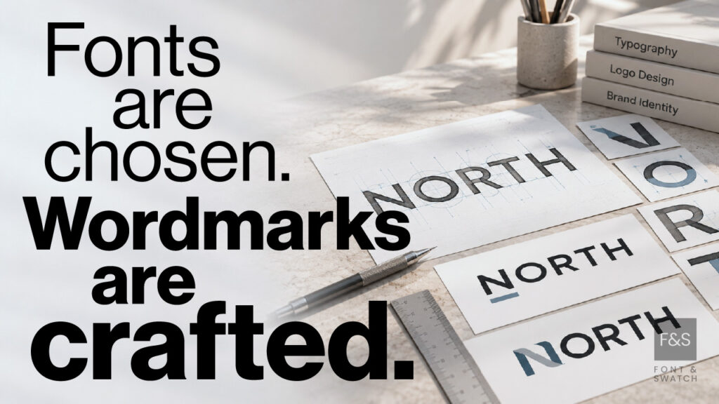
Choosing a Font Isn’t the Same as Designing a Wordmark
This is where professional typographic design becomes particularly interesting.
A font is a predefined collection of letterforms designed to work across many different words and applications.
A wordmark is a typographic logo specifically developed to represent a particular business name.
It may begin with an existing typeface, but that’s often where the detailed design work starts.
Consider the individual letters within your company name.
Some are wide. Others are narrow. Curved letters sit alongside straight forms. Certain combinations create awkward spaces, while others offer opportunities for distinctive visual relationships.
A skilled designer considers the entire word as a composition.
Not simply a collection of letters.
That involves examining technical details such as:
- Kerning: Adjusting the space between individual letter pairs to create visual balance.
- Tracking: Controlling the overall spacing and rhythm across the lettering.
- Letterform construction: Refining the shapes, curves, proportions and structural characteristics of individual characters.
- Terminals and crossbars: Customising the finishing details and internal structures that contribute to typographic personality.
- Optical alignment: Making visual adjustments where mathematically equal spacing or alignment doesn’t appear balanced.
- Wordmark proportions: Ensuring the complete name has an appropriate silhouette, visual weight and relationship between positive and negative space.
These refinements can appear surprisingly subtle.
But collectively, they can transform familiar typography into a distinctive expression of a brand.
A customised curve. An unexpected letter connection. A carefully balanced relationship between two characters.
Details that give the wordmark its own recognisable character.
Making letters unnecessarily unusual can compromise readability and create practical reproduction problems.
Sometimes an intelligently selected existing font, combined with thoughtful modifications and meticulous typographic refinement, produces exactly the right result.
Good wordmark design is about making deliberate choices, not making every letter complicated.
What Should a Professional Branding Agency Do Differently?
Professional logo design should begin long before anyone starts exploring fonts.
At Font & Swatch, we believe powerful brands start with strong foundations.
That means understanding the business before deciding how it should look.
1. Understand the Brand
What is the business Purpose? Who is the audience? What makes it unique? How does it want to be perceived by its audience and competitors?
These questions establish the strategic direction behind the creative work.
2. Understand the Market
Competitor and category research identifies established visual conventions and opportunities for differentiation.
Which characteristics communicate credibility? Which have become overused? Where can the brand develop a distinctive position?
3. Develop the Visual Identity
This is where strategic thinking becomes design.
Typography, wordmarks, symbols, proportions, colour relationships and supporting graphic elements are developed into a coherent identity.
The objective is to create something appropriate and recognisable, rather than simply something fashionable.
4.Test the Design
A logo needs to work beyond the presentation screen.
How does it reproduce at small sizes? In black and white? On packaging, merchandise, signage or embroidered apparel?
Does its distinctive character survive different production methods?
Can the visual identity accommodate new products, audiences or markets?
5. Build the Brand System
Finally, the identity needs the supporting technical structure to function consistently.
That includes approved logo variations, typography, colour specifications, clear-space requirements, artwork formats and practical brand guidelines.
Font licensing, reproduction requirements and appropriate intellectual property considerations should also be addressed.
This process doesn’t guarantee that a brand will become a market leader.
But it gives the business a considered, technically sound foundation on which to build recognition and grow.
And that’s a considerably stronger proposition than simply choosing the most appealing logo from a selection of templates.
Does Your Existing Logo Need a Redesign?
Not necessarily.
If your logo feels too similar to your competitors, the solution isn’t automatically to make it louder, stranger or more elaborate.
Sometimes the original identity is sound, but its application has become inconsistent. Sometimes the typography needs refinement rather than replacement.
And occasionally, a business has evolved to the point where its existing identity no longer represents its position or ambitions.
Before making that decision, consider five questions:
- Is your logo distinctive within your market? Or could it easily be confused with competitors?
- Does the typography reflect your brand’s personality and positioning? Or is it simply following a familiar industry trend?
- Is the wordmark technically sound? Does it reproduce clearly and consistently across the applications your business requires?
- Does your wider visual identity support recognition? Or are your typography, colours and graphic elements working independently?
- Will the identity remain relevant as your business develops? Or has it been designed primarily around today’s preferred aesthetic?
The answers can help determine whether your identity needs refinement, a broader refresh or a more substantial rebrand.
Distinctive Doesn’t Have to Mean Complicated
Some of the most effective wordmarks are remarkably simple.
Their strength comes from thoughtful typography, carefully resolved details and a clear relationship with the business they represent.
A distinctive brand can use a sans-serif font. It can use a serif. It can be restrained, expressive, traditional or contemporary.
What matters is that those choices have been made deliberately.
At Font & Swatch Branding Agency Sydney, we create brand identities built on strategic thinking, technical expertise and considered design.
Because a strong brand should do two things.
It should communicate who you are.
And it should help people recognise you among everyone else.
Your logo doesn’t need to be the loudest in the room. But it should look like it belongs to you.
If your brand is starting to look a little too familiar, perhaps it’s time to reconsider what makes it distinctive.
