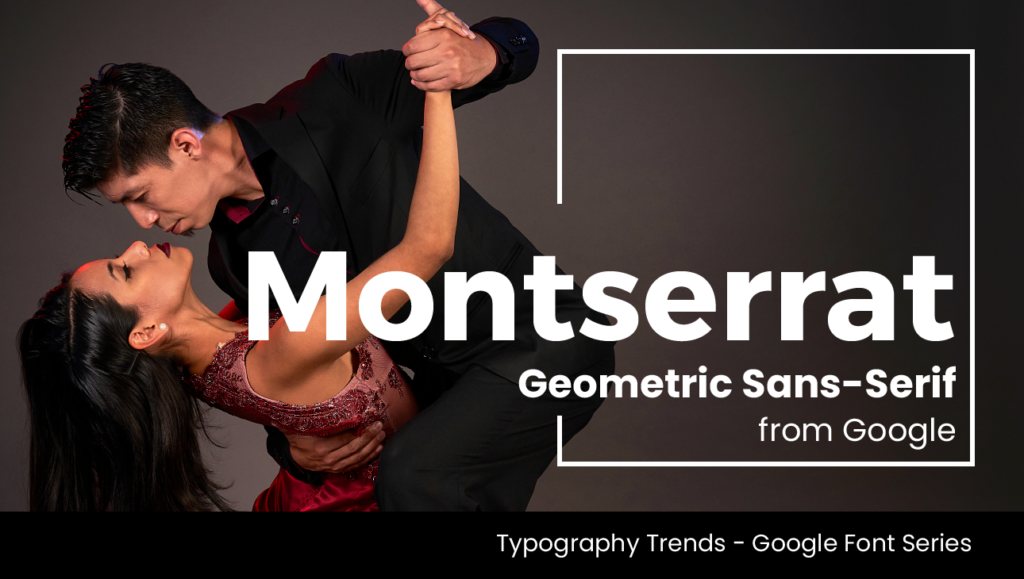
Montserrat Font is a geometric sans-serif font released by Google in 2011.
Inspired by the old posters and signs in the traditional Montserrat neighbourhood of Buenos Aires, Montserrat Font was created in 2010 by Argentine artist Julieta Ulanovsky in a homage to the beauty of the urban typography that emerged in the neighbourhood in the first half of the twentieth century. In 2018 Montserrat Font became the official font for documentation, presentations and publicity for the Government of Mexico and since 2021 has been Puerto Rico’s official typeface for body text and its agency’s logos.
Julieta Ulanovsky describes her inspiration for the Montserrat Font:
“The old posters and signs in [Montserrat] inspired me to design a typeface that rescues the beauty of urban typography from the first half of the twentieth century. The goal is to rescue what is in Montserrat and set it free, under a free, libre and open-source license.
As urban development changes [Montserrat], it will never return to its original form and loses forever the designs that are so special and unique. To draw the letters, I rely on examples of lettering in the urban space. Each selected example produces its own variants in length, width and height proportions, each adding to the Montserrat family. The old typographies and canopies are irretrievable when they are replaced.
There are other revivals, but those do not stay close to the originals. The letters that inspired this project have work, dedication, care, colour, contrast, light and life, day and night! These are the types that make the city look so beautiful.”
We love Montserrat’s versatility across digital and print media. Montserrat Font is most seen on websites and in online media, however its high readability and ease of scaling make it suitable in publishing, as a brand font, for editorials and of course on posters and signage. Montserrat Font’s geometric and elegant simplicity is central to its versatility, with a large X-height, it creates a majestic yet fun appearance. Letterforms such as the uppercase G, J and Q have wonderful quirks to set it apart from similar geometric san-serif fonts such as Gotham and Proxima Nova making it more informal, less extended and more idiosyncratic. It also possesses a lot more character than the mainstays of Arial and Helvetica .
Like the soul of South American nightlife, Montserrat Font is perfect when your brief is searching for a font that is Refined, Majestic and Informal. Montserrat Font is a sans-serif family with multiple versions and multiple possibilities. It is also available on Adobe Fonts.
If you like, you can read more about Montserrat Font here and Julieta Ulanovsky’s inspiration for the Montserrat Font here.
