Soft, yet not shy. Warm, without shouting. Primrose Pink (Pantone 12-2904) is a colour that speaks in measured tones—gently illuminating, gracefully energising, and never overplaying its hand. It’s a colour of subtle power, the kind that creates its impact not by dominating, but by engaging.
At Font & Swatch Branding Agency Sydney, we believe that powerful brands engage their audience, and this colour does this with remarkable finesse. It’s a tone that refuses the extremes of pastel innocence or fluorescent intensity. Instead, it walks the line between vitality and refinement—making it a highly strategic choice for brands looking to assert warmth and sophistication.
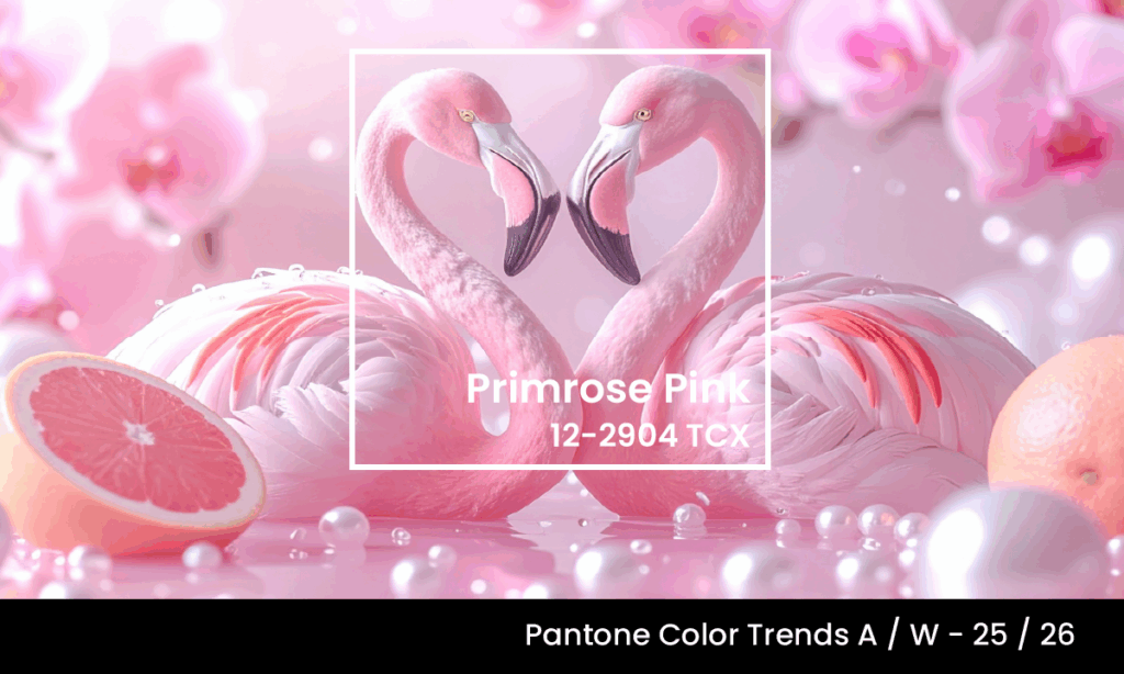
What Is Primrose Pink?
Primrose Pink sits comfortably within the warm pink spectrum, with a visual character that leans closer to a light fuchsia or magenta. Its shows a high proportion of red, offset by gentle measures of green and blue that lend it its distinctive warmth and softness. Its saturation and light make it a bright, yet controlled colour with a clear identity.
This pink is vivid and saturated, yet carries a surprising depth thanks to its subtle violet undertones. The result is a pink that energises but also soothes; it invigorates but never overwhelms.
The Emotional Resonance Of Primrose Pink
While often categorised with romantic or gentle tones, Primrose Pink subverts those clichés. It evokes energy and excitement, but tempers them with a polished undertone. There’s nothing chaotic here—just purpose. This is not a colour that screams; it communicates with calm authority.
This colour is what we at Font & Swatch call a “conversational colour.” It speaks directly to emotions, but in ways that feel tailored, thoughtful and intentional. It can feel youthful in one setting, nostalgic in another, and quietly confident in a third. This versatility makes it a powerful ally in brand storytelling.
And in an era where brands need to be powerful to cut through the noise, this pink offers a route to strength through elegance.
Strategic Uses In Branding And Design
At Font & Swatch, we don’t choose colours for aesthetics alone—we choose them for strategic function. Here’s how we see Primrose Pink working across different brand environments:
1. Beauty & Wellness:
With its luminous softness, Primrose Pink is a natural fit for skincare, cosmetic and wellness brands. Used in packaging, it lends a gentle confidence—suggesting care, precision, and sophistication. For fragrance or luxury beauty, it creates an emotional pull.
2. Digital Brands:
In the digital space, this shade excels as an accent colour. Its warmth adds life to clean interfaces, especially when paired with neutrals like Wax Paper or minimalist greys. On social media, it captures attention in a feed without shouting for it—making it ideal for sophisticated consumer-facing platforms.
3. Corporate and Professional Services:
This may be surprising, but Primrose Pink is not off-limits in professional contexts. When used in small doses—logo accents, infographics, or branded templates—it can signal creativity, emotional intelligence, and forward-thinking. For brands need to project a human-centric aesthetic to their branding, this level of sensitivity matters.
How To Pair Primrose Pink
Primrose Pink plays well with others. For visual systems, we recommend pairing it with:
- Wax Paper (Coloro 035-88-12): A near-neutral that anchors Primrose Pink’s energy in warmth and clarity.
- Fresh Purple (Coloro 136-32-33): For brands that want expressive edge and artistic tension.
- Stone or Cool Greys: These tones add structure, particularly in corporate or minimalist designs.
In each case, Primrose Pink brings the emotional layer—the quality that makes a brand feel considered, not just constructed.
Why Brands Need Primrose Pink In 2025/26
Colour trends are shifting. As digital spaces become more saturated and AI-driven design expands, the demand for colours that feel personal, intentional and emotionally resonant grows stronger. Primrose Pink answers this call.
At Font & Swatch, we often say: A strong Brand dominates or disrupts its marketplace. Primrose Pink may not look like a disruptor at first glance—but that’s its strategy. It’s the brand whisperer. The quietly powerful voice in the room. And in a world of sensory overload, this is the colour that earns attention by being different, not louder.
Final Thoughts
Primrose Pink offers more than an aesthetic trend. It’s a colour that delivers on clarity, confidence and connection. For brands seeking warmth without sentimentality, vibrancy without volatility, it offers a middle path.
At Font & Swatch Branding Agency Sydney, we help clients build brand identities that don’t just look right—they feel right. And colours like Primrose Pink are central to that mission.
Font & Swatch create Brand Identities that not only define but elevate. If you’re ready to explore how Primrose Pink could bring refinement, resonance and relevance to your brand, we’d love to chat.
Stay Ahead of Colour Trends
If you found Primrose Pink inspiring, explore more trending colours:
