
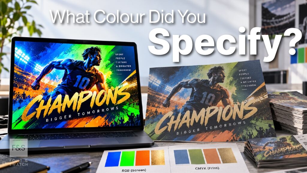
Why accurate colour specification matters across print, digital, merchandise and every brand touchpoint.
Colour is one of the most recognisable assets a brand owns.
Colours are immediately familiar because they’ve become deeply connected to the identities they represent.
But there’s an often-overlooked challenge in managing your brand’s visual identity.
The colour you approve isn’t necessarily the colour your audience will see.
A colour that may look correct on screen can appear noticeably different in print, packaging, apparel, signage or merchandise. Even when suppliers are working from the same brand guidelines, the final results often vary.
For marketing leaders and brand custodians, this presents an important question: how do you protect the integrity of your brand colour across every application?
For sports licensing executives managing multiple manufacturers and merchandise categories, the challenge is particularly significant. Jump to Colour Specification in Sports Licensing
The answer begins with getting your colour specifications right.
At Font & Swatch we’re specialists in brand colour specification, particularly the challenge of translating colour accurately from digital to the physical world.
It’s a discipline that requires an understanding of colour systems, materials, inks, finishes and manufacturing processes.
One Brand Colour. Many Different Applications.
A strong brand identity must maintain a consistent visual appearance across every application, from digital screens and printed publications to sporting merchandise, apparel, packaging, event signage and promotional products.
However, colour reproduction varies significantly depending on the materials, processes and technologies involved.
Digital displays generate colour through emitted RGB light, while conventional printing relies on CMYK or specially formulated inks. Textiles use dyes, pigments and manufacturing techniques, while metallic finishes depend on reflective properties that cannot be replicated through standard colour reproduction.
Substrate characteristics, surface finishes, ambient lighting and viewing conditions can further influence perceived colour.
Consequently, specifying a single HEX, RGB, CMYK or Pantone reference does not guarantee consistent visual results across different applications.
The objective is to maintain the intended visual appearance and colour consistency of the brand across all media and materials — rather than simply applying the same numerical colour specification.
Spotify Green: Consistency Across Every Environment
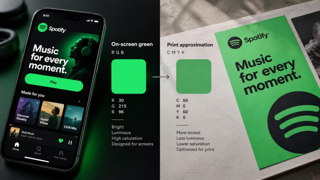
Spotify’s distinctive green is central to its brand recognition, particularly across digital platforms
However, translating a bright, saturated green into print, packaging, apparel and printed merchandise requires additional considerations.
You cannot apply the same formula across different production techniques and materials and expect the same outcome.
In Spotify’s case, rather than relying on a single colour specification, they developed a series of approved fallback greens to accommodate different reproduction methods while maintaining a recognisable visual identity. The result was a more flexible colour system that balanced visual impact with practical production requirements.
A well-developed colour system specifies appropriate reproduction methods for different environments while protecting the brands visual integrity.
HP Electric Blue: What Works on Screen May Not Work in Print

Highly saturated colour can perform beautifully in a digital environment yet lose some of its intensity when reproduced physically.
HP’s Electric Blue illustrates this challenge.
Saturated colours like HP’s Electric blue fall outside the colour range achievable through conventional CMYK printing.
Consequently, the appearance on screen will differ from the result on a printed page often appearing duller and moving significantly lighter or darker depending on the saturated colour.
The HP example highlights the use of different colour specifications, including a Pantone reference and a conventional print alternative, to address different production requirements.
For brand custodians, this illustrates the importance of understanding how a colour performs before committing to it across an identity system.
A brand colour must be evaluated for the environments where it will appear, not simply for how it looks on screen.
A good colour specification anticipates these differences and provides practical guidance for reproducing the intended appearance.
Harley-Davidson Orange: When Recognition Depends on Consistency
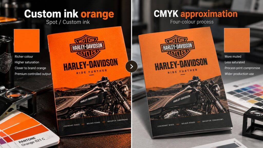
For Harley-Davidson, its distinctive orange is a fundamental element of its visual identity, communicating energy, individuality and a strong connection to the brand’s motorcycle heritage. However, maintaining accurate colour reproduction across packaging, merchandise and printed communications presents a technical challenge.
Conventional CMYK printing produces colours by combining cyan, magenta, yellow and black inks, but its achievable colour gamut and reproduction characteristics can limit the accuracy and consistency of highly saturated oranges. The final appearance can also vary depending on paper stock, ink absorption, surface finish and printing conditions.
To address these challenges, Harley-Davidson’s packaging production guidelines specified the use of a specially formulated orange spot ink rather than relying solely on a standard CMYK combination.
Unlike process printing, a spot colour uses a premixed ink formulated to achieve a specific colour appearance. This provides greater control over hue and saturation, helping to minimise variation between production runs and maintain a more consistent brand presentation across approved printed applications.
When a particular colour is a valuable brand asset, selecting the appropriate production process is just as important as selecting the colour itself.
That becomes even more important when multiple manufacturers or licensees are responsible for reproducing the same brand.
Olympic Gold: The Finish Matters
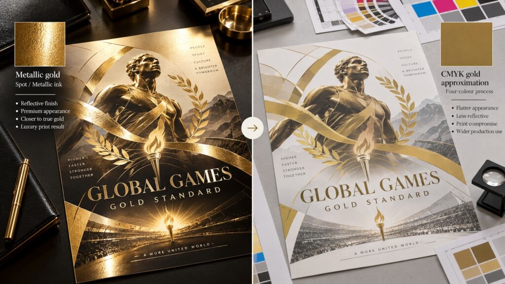
For the Olympic Games, gold, silver and bronze are internationally recognised symbols of achievement, prestige and sporting excellence.
However, reproducing their metallic appearance consistently across different media presents a technical challenge. Standard CMYK printing uses combinations of cyan, magenta, yellow and black inks to simulate colour, but these conventional inks cannot replicate the reflective properties of genuine metallic finishes.
As a result, gold is typically reproduced as a flat yellow-brown tone, while silver becomes a neutral grey, and bronze a dull brown, losing the lustre and visual depth associated with metallic surfaces.
To address these limitations, the International Olympic Committee’s brand guidelines specify dedicated Pantone metallic inks for gold, silver and bronze, alongside CMYK alternatives in flat and gradient colour for applications where specialist printing is impractical.
Metallic inks contain reflective particles that interact with light differently from conventional process inks, producing a more authentic metallic appearance. By establishing separate production specifications, the brand can achieve greater visual consistency while accommodating different printing processes, materials and budgets.
Effective brand colour management means specifying the appropriate production method to achieve the intended visual result — not simply relying on a colour value.
Colour Specification in Sports Licensing
In sport, the challenge is amplified by the scale and diversity of licensed merchandise.
A sporting organisation’s colours may need to appear consistently across teamwear, replica jerseys, supporter apparel, accessories, memorabilia, retail products, digital channels and major event environments.
Each category can involve different materials, suppliers and manufacturing techniques.
And every variation presents an opportunity for a brand colour to be reproduced incorrectly.
This is where colour specification becomes an important part of brand governance.
Comprehensive brand guidelines and art packs should establish more than a colour palette. They should address:
- Approved digital, print and spot-colour references
- Textile, thread and material-specific colour requirements
- Specialist finishes and approved alternatives
- Physical reference samples and acceptable tolerances
- Production and approval requirements for licensees
A well-developed Kit of Parts can help licensees work within a consistent visual system while accommodating the practical realities of different product categories.
The goal isn’t to remove flexibility from manufacturers.
It’s to give them the guidance needed to achieve the best possible result for the application.
A brand’s colour integrity should not depend on individual suppliers interpreting what the correct colour might be.
Choosing the Right Colour Is Only Half the Job
Considerable attention is given to selecting the right colours when developing a brand identity. But the process shouldn’t end when the palette is approved.
Every important brand colour should also be assessed for its performance across digital, print, apparel, packaging, signage and merchandise.
That may require different colour references, specialist inks, material testing or approved alternatives.
These decisions are best made during brand development, rather than being left to suppliers further down the production process.
A carefully chosen brand colour has limited value if it cannot be reproduced with the intended consistency.
Colour Is in Our Name
At Font & Swatch, colour selection and accurate specification are core parts of our brand identity expertise.
We understand the technical challenges of moving colour from the digital environment into physical applications, where inks, materials, finishes and manufacturing processes can produce very different results.
Our experience across global sport, branding, visual communication and merchandise helps us develop colour specifications that are practical, accurate and appropriate for their intended use.
We create brand identities supported by the technical foundations needed for consistent reproduction.
They’re developed through careful decisions that allow those colours to perform consistently across the wider brand experience.
Is Your Brand Colour Being Reproduced Correctly?
If your brand appears across multiple materials, suppliers or licensing categories, your existing colour specifications may need a closer look.
Font & Swatch can help you establish the appropriate colour references, production requirements and application guidelines to protect your brand’s visual identity.
Talk to Font & Swatch about specifying your brand colours correctly, from digital screens to physical products.
Frequently Asked Questions
Why does my brand colour look different in print than on screen?
Digital screens create colour using light, while printing uses inks. Their different colour capabilities mean some vibrant screen colours cannot be reproduced exactly in conventional printing. Accurate colour specification helps identify suitable alternatives.
Is a Pantone colour enough to ensure brand consistency?
Not always. A Pantone reference is valuable, but different materials, finishes and manufacturing processes can affect the final appearance. Additional specifications and physical reference standards may be needed.
How can sports brands maintain consistent colours across licensed merchandise?
Through comprehensive brand guidelines, material-appropriate colour specifications, approved reference samples and structured licensee approval processes. These provide manufacturers with clear reproduction standards across product categories.
