In a season where colour often hibernates beneath frosty landscapes, Winterberry 17-1640 refuses to be muted. Bold yet romantic, assertive yet intimate—this rich pink-red lights up winter’s subdued canvas like ripe berries against snow.
At Font & Swatch Branding Agency, we believe that powerful brands engage their audience—and Winterberry does so not by shouting, but by stirring something deeper: memory, emotion, warmth, and strength.
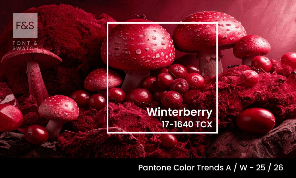
What Is Winterberry?
Pantone 17-1640 TCX, known simply as Winterberry, is a sumptuous, medium-dark red infused with subtle berry-pink undertones. Its a colour that sits confidently between the assertiveness of crimson and the softness of rose. The result? A red that feels emotive without being overwhelming, sensual without being saccharine.
This colour takes its name from a resilient shrub better known as the winterberry plant, which produces brilliant red berries that defy the grey monotony of winter. It’s a botanical metaphor for perseverance, beauty, and life-force in harsh conditions and it’s these qualities that make this red so resonant in design.
The Emotional Resonance Of Winterberry
Passion With Sensitivity
Winterberry tempers its heat with nuance. Its pink undertone adds a layer of tenderness, making it a red that connects rather than commands. It’s a hue of intimacy, not intimidation—a whisper of romance, not a blaze of conquest. For brands and designers, this duality is invaluable. This colour projects confidence and charisma but never loses its warmth.
Vitality And Resilience
Winterberry recalls the natural flush of cheeks in cold air, the richness of ripe berries, or the warmth of a fire against a stark backdrop. It’s a visual metaphor for the spark of life—especially when things feel bleak. The colour’s namesake plant thrives in freezing temperatures, and the colour carries the same symbolism: endurance, renewal, and beauty that persists. This makes it especially powerful for brands looking to convey emotional depth, authenticity, and tenacity.
Strength In Femininity
Winterberry sits between classic red and empowered pink. It challenges the tired dichotomy between “masculine assertiveness” and “feminine delicacy.” Instead, it offers an evolved, expressive femininity—bold, resilient, and unapologetically confident. In a cultural moment where strength and softness are no longer mutually exclusive, Winterberry becomes a flagbearer for brands that embrace complexity, character, and contemporary femininity.
How To Use Winterberry In Branding
Differentiating In Competitive Markets
Colour psychology tells us red hues naturally draw attention. But unlike harsh reds that shout for dominance, Winterberry invites attention. It’s sophisticated, magnetic, and memorably distinct. In crowded categories—especially where blue and grey dominate—this red becomes your visual differentiator.
Packaging & Product
This winter shade adds richness and allure to product packaging. For luxury goods, it reads as premium and passionate. For seasonal ranges—especially around winter or holidays—it creates emotional lift and festive intimacy.
Digital & UI
In digital design, Winterberry stands out without dominating. It can be used as a highlight colour for call-to-actions, headers, or UI elements to create emotional engagement—especially when offset against neutrals like off-white or cream.
Strategic Uses In Brand Identity
At Font & Swatch, we understand that colour isn’t just a visual element—it’s a strategic signal. This colour is ideal for brands that want to:
- Convey Depth And Emotion: Perfect for industries like mental wellness, luxury fashion, and artisanal food or wine.
- Balance Strength And Empathy: Ideal for brands wanting to communicate empowerment, human connection, and courage with warmth.
- Stand Out In Cool Palettes: Winterberry offers a dynamic contrast against desaturated winter palettes or tech-driven greys.
This is not a colour that fades into the background. It holds space—gracefully, powerfully, and with purpose.
Final Thoughts:
Pantone’s 17-1640 is a seasonal flourish of enduring meaning. This red is a powerful tool for expression, resonating and enduring.
At Font & Swatch Branding Agency Sydney, we help businesses harness colour as a strategic asset, embedding it into identity systems that evoke, engage, and endure. Winterberry is a perfect example of a colour that captures hearts while strengthening brand presence.
If your brand is ready to ignite warmth, resilience and emotional clarity—let’s explore what Winterberry could do for you.
Stay Ahead of Colour Trends
If you found Winterberry inspiring, explore more trending colours:
