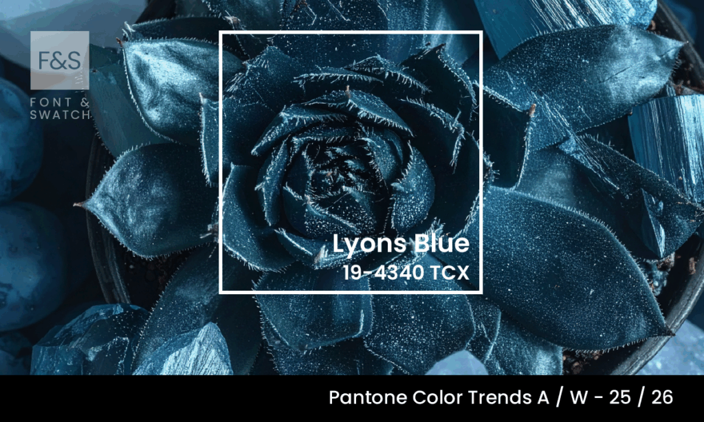
Lyons Blue (Pantone 19-4340) is deep, reserved, and steeped in historical weight. This saturated blue evokes the grandeur of heritage .
A Colour Born Of Craft And Legacy
Lyons Blue, or “Bleu de Lyon” as it has been known in its French origins, harks back to the 16th-century silk trade. The city of Lyon was Europe’s undisputed silk capital, and from its ateliers emerged a luxurious shade—almost black under dim light, but blue enough to whisper elegance. Worn by aristocrats, sewn into ecclesiastical robes, and woven through ceremonial garb, Lyons Blue built its legacy as the colour of quiet power and craftsmanship.
Today’s Lyons Blue (Pantone 19-4340) captures that essence, yielding a modern, teal-tinted navy. Offering the visual depth that designers crave in a dark tone without sacrificing character it ensures presence across both digital and physical applications.
This is not a shade that fades into the background.
Elegance, Not Flash
Lyons Blue is not about novelty. Its elegance lies in its restraint. Where electric blues may shout, Lyons Blue converses—calmly, confidently, and with gravitas.
It aligns with timeless design and heritage craftsmanship, making it particularly relevant for institutions, luxury products, and premium service providers. Used correctly, it cues refinement without needing embellishment. Think of it not as “fashionable,” but as enduring—a colour with lineage.
At Font & Swatch, we see this as a key advantage. A strong brand dominates or disrupts its marketplace, but not always through volume or shock value. Lyons Blue lets the work speak for itself.
Authority, Artisanship And Prestige
Blue has always held symbolic weight in governance and ceremonial display—uniforms, legal robes, diplomatic stationery. Lyons Blue builds on that tradition. It evokes institutional strength and intellectualism, but with a crafted, human hand. It is as much a nod to artisan mastery as it is to corporate credibility.
The connection to textile heritage in Lyon isn’t merely anecdotal. The colour’s signature saturation mirrors the pigment-rich dyes applied by the canuts—the silk weavers of the 1800s whose fabrics defined European luxury. In branding, Lyons Blue evokes that sense of touch: textured, layered, deliberate.
This colour suits businesses that appreciate the slow burn over the quick win—architecture studios, bespoke legal firms, cultural organisations, educational institutions, and brands that lead with expertise rather than trend.
Emotional Depth And Visual Weight
Under certain lights, Lyons Blue may almost disappear into black. In brighter contexts, its blue-green undertones emerge, suggesting clarity and thoughtfulness. It’s contemplative. Subdued, but never inert.
Used in digital interfaces, it brings depth without glare—more often used as the base or background to contrast against vibrant accents like Bubblegum Pink, which brings unexpected playfulness, or Green Sheen, which adds a cutting-edge freshness. In print, Lyons Blue offers contrast without fatigue. In interiors and branded environments, it signals quality—often subconsciously. Lyons Blue isn’t emotionally loud; it’s emotionally resonant.
At Font & Swatch, we believe powerful brands engage their audience—often through subtlety, not spectacle. Lyons Blue sits at the intersection of melancholy and serenity, commanding space without overclaiming it.
Branding Applications
Primary Colour Usage: Lyons Blue serves as a grounded base for corporate identities. It can become the anchor for visual language—paired with Nimbus Cloud, a soft grey that brings quiet sophistication, Bright White for contrast and clarity, or tones like Toasted Almond and Tannin to introduce warmth and tactility. These combinations elevate formality and tactile appeal, ideal for print, packaging or presentation.
Accent Roles: In minimal layouts or luxury packaging, Lyons Blue functions effectively as an accent. Used in typography or graphic motifs, it balances modernism with tradition. Pair it with Mykonos Blue for tonal harmony and layered brand storytelling.
Digital UI and Product Design: For apps, dashboards, and websites, Lyons Blue is a reliable choice for creating hierarchy. It lends gravity to buttons, navigation bars and call-outs—ideal for fintech, law, or health brands. It pairs particularly well with clean backgrounds in Bright White or muted containers in Nimbus Cloud.
Interior and Environmental Branding: Lyons Blue works especially well in environments requiring calm confidence. Boardrooms, receptions, boutique retail, and curated event spaces benefit from its dignified presence—particularly when offset with organic hues like Toasted Almond or energised by contemporary accents like Green Sheen.
Why Brands Should Consider Lyons Blue Now
With current visual cultures drifting toward ‘authentic luxury’—a blend of prestige, craft, and human depth—Lyons Blue is a smart strategic choice. It does not try to sell itself. It presents, waits, and leaves an impression. This is branding for brands that trust in their own value.
As many brands reassess their tone post-digital saturation, this shade invites a quieter path forward. A way to build brands that don’t just flash across screens but live in memory.
Final Thoughts
Lyons Blue 19-4340 is a study in contrast: dark yet luminous, traditional yet adaptable, understated yet impactful. It speaks to brands with heritage or those aspiring to create one. Whether as a lead tone or a complementary layer in your identity suite, it enables clarity, continuity, and craft.
At Font & Swatch, we create brand identities that last. We don’t chase trends—we align your strategy with timeless design principles that elevate trust, credibility, and emotion.
If your brand is ready for Lyons Blue, we’re ready to help you make it unforgettable.
Font & Swatch Branding Agency Sydney—We help brands find their depth, clarity and strength.
Stay Ahead of Colour Trends
If you found Lyons Blue inspiring, explore more trending colours:
