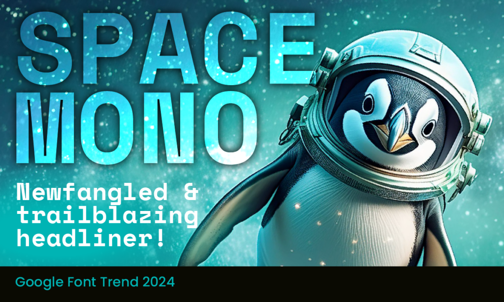
Space Mono, it’s a cosmic experience for creating powerful and engaging brand identities.
Origins and Design
An original fixed-width type family designed by Colophon Foundry for Google in 2016, Space Mono is not your typical monospaced font. Its name playfully inverts its own typographical classification, setting the stage for a typeface that breaks the mold. Created to support a Latin Extended glyph set, it’s perfect for English and other Western European languages. This font, designed for editorial use in headlines and display typography, marries geometric precision with the quirky details of 1960s headline typefaces like Microgramma and Eurostile, giving it a retro-futuristic charm that feels both nostalgic and forward-thinking.
Typographic features abound in Space Mono: old-style figures, superscript and subscript numerals, fractions, centre-height and cap-height currency symbols, directional arrows, and multiple stylistic alternates. This extensive range ensures it meets diverse typographic needs, whether for print or digital use.
The Creation of Space Mono
The creation of Space Mono was a journey of typographic exploration. Unlike traditional monospaced fonts designed for text-intensive, small-point-size applications, Space Mono was envisioned on a grand scale. Drawing inspiration from the speculative fiction of sci-fi films and TV, it embodies the look and feel of futuristic displays on interplanetary vessels and high-tech dashboards.
During its eight-month development, Space Mono’s unique personality emerged, particularly through key characters like the lowercase ‘g’ and uppercase ‘R’. These characters blend geometric shapes with humanistic strokes, creating a typeface that’s quirky, friendly, and inherently retro-future.
Versatility and Application
Space Mono isn’t just about aesthetics; it’s about functionality too. Used on over 170,000 websites daily and served via the Google Font API approximately 53 million times per week, its popularity speaks volumes. Its four styles—Regular Mono, Regular Italic Mono, Bold Mono, and Bold Italic Mono—provide the flexibility needed for various design needs.
Branding Recommendations
When incorporating Space Mono into your branding, keep these tips in mind:
- Use Bold Sparingly: To maintain legibility and visual appeal, add a bit of extra letter spacing when using bold weights.
- Pair Wisely: Space Mono pairs beautifully with sans-serif fonts like Space Grotesk, Replica, and Helvetica, creating a harmonious balance.
- Highlight Key Elements: Use Space Mono for headings, logos, and key phrases to draw attention and convey a modern, tech-savvy image.
Emotions Conveyed in Logos, Branding, and Marketing
Space Mono’s charm lies in its ability to convey a range of emotions. Its geometric precision and quirky details evoke a sense of innovation, friendliness, and a hint of nerdy charm. Perfect for tech brands aiming to be approachable, it also resonates well with creative and artistic brands looking to stand out.
Whether used in logos, social media graphics, or marketing materials, Space Mono’s retro-futuristic aesthetic captivates audiences, making a memorable impression. Its dotted numeric “0” helps distinguish it from the letter “O”, enhancing readability and adding to its distinctive character.
Conclusion
Space Mono is more than just a monospaced font; it’s a typographic journey through time and space. By blending geometric precision with retro-futuristic charm, it offers a unique voice for brands aiming to disrupt and dominate their markets. Whether you’re a designer, developer, or marketer, Space Mono provides the tools to create powerful and engaging brand identities.
Font & Swatch Branding Agency Sydney: Unlocking the power of your brand, making it remarkable.
If you’d like to explore more fabulous fonts for your brand and social media channels, check out these posts:
- Oswald – Where Serious Meets Style
- Abril Fatface – Timeless Elegance & Bold Allure
- Pacifico Font – Surfs Up!
- Vollkorn – quiet, modest and elegant
- Playfair – classically designed with modern appeal
- Montserrat – inspired by the beauty of Buenos Aries
- Lato Font – its Polish for Summer
- Comforter – the kitten of Google Fonts
- Gotham – the font that elected a President
Every customer touchpoint with your brand should communicate personality, value, and invoke the desired emotional response. At Font & Swatch, we work to unlock the true power of your brand, making it remarkable.
