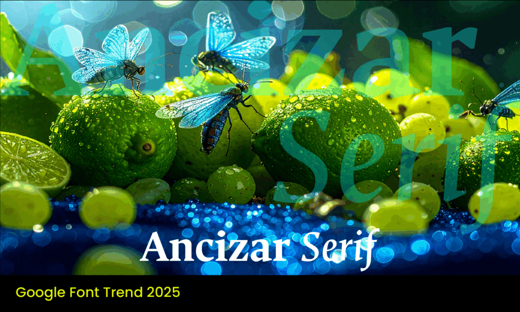
Ancízar Serif is a typeface designed for clarity, adaptability, and intellectual character. Originally developed in 2014 for the Universidad Nacional de Colombia (UNAL), this serif typeface was crafted to enhance the university’s institutional identity. In 2024, UNAL made the typeface publicly available, offering it as a gift to the global design community—a contribution from Colombia’s largest public university to the world of typography.
Now part of the Google Fonts library, Ancízar Serif is available for designers, educators, and institutions seeking a typeface that balances academic authority with everyday readability.
Designed For Institutional Integrity And Everyday Use
Ancízar Serif was created by Professor César Puertas, Viviana Monsalve, and Julián Moncada, under a broader initiative led by UNIMEDIOS, the university’s communications and media division. The goal was to develop a typeface that represented the ethos of public education—accessible, inclusive, and grounded in knowledge.
The result is a highly legible serif font family with a structure that is both stable and elegant. Its forms are balanced and clear, designed to excel in long-form reading environments like academic texts, reports, and editorial publishing, while still performing smoothly in digital contexts.
Structure and Features
Nine Weights For Flexible Design
Ancízar Serif is part of a larger type family that includes both Serif and Sans Serif styles, with nine weights ranging from Thin to Black. This flexibility makes it suitable for everything from body copy to emphatic headlines, allowing designers to maintain typographic consistency across various brand touchpoints.
Optimised For Screen And Print
While initially built for print—academic journals, essays, and official university documents—the font’s design translates effectively to screens. The streamlined curves and even spacing retain legibility at small sizes and high pixel density, which is essential for websites, mobile apps, and online publications.
Advanced Typographic Support
Ancízar Serif includes a robust character set, supporting:
- Western Latin
- Monotonic Greek
- International Phonetic Alphabet (IPA)
- Diacritics
- Small caps
- Proportional and tabular numerals
With over 1,000 characters per font, Ancízar Serif gives designers a comprehensive toolkit for multilingual and academic typography.
Where Ancízar Serif Works Best
1. Academic And Educational Design
This font was built for higher education. Its roots in the university system make it a natural fit for institutions, researchers, and publishers seeking a professional but warm tone. Whether it’s an e-learning platform, a research paper, or an academic brand identity, Ancízar Serif provides a refined yet accessible visual language.
2. Editorial And Long-Form Content
Ancízar’s strength lies in its readability over extended texts. With proportions and kerning tailored for comfortable reading, it’s ideal for magazines, essays, annual reports, and white papers. Its serif details help guide the reader’s eye, creating a smooth experience across paragraphs.
3. Multilingual And Technical Publishing
Thanks to its wide character set and support for IPA and Greek, Ancízar Serif is also well-suited for linguistic, scientific, and technical publications. Its typographic precision supports complex formatting, such as phonetic transcriptions, footnotes, and academic citations.
Font Pairings
To create a complete visual system, Ancízar Serif pairs well with its Sans Serif sibling for hierarchy and contrast. It also works effectively with:
- Roboto – A neutral, versatile body text font for digital formats.
- Lato – A softer sans-serif for lighter interface or editorial use.
- Source Sans Pro – Excellent for UI/UX text in reports or presentations.
A Typeface With Purpose and Legacy
Ancízar Serif is more than a tool for typography—it’s a reflection of public service, design excellence, and open collaboration. Its release as a free and open-source typeface in 2024 embodies the ideals of knowledge sharing and global accessibility.
At Font & Swatch Branding Agency Sydney, we believe that strong brands are built not only on aesthetics but on purpose. Fonts like Ancízar Serif allow brands, institutions, and publishers to express credibility, clarity, and cultural depth. It’s a thoughtful choice for organizations that need to communicate with seriousness and inclusivity.
Font & Swatch Branding Agency specialises in creating powerful brand identities that engage audiences and stand out in competitive markets.
- Genos Font – A Futuristic Display Typeface
- Ubuntu Font – Clean & Modern, Made For Screens
- Fajalla One – Bold, Condensed and Created To Be Noticed
- Teko Font – Bold Simplicity With Cultural Flair
- Ojuju Font – Born Of African Dogon Dancers
- Space Mono – Newfangled And trailblazing
- Oswald – Where Serious Meets Style
- Abril Fatface – Timeless Elegance & Bold Allure
- Pacifico Font – Surfs Up!
- Vollkorn – quiet, modest and elegant
- Playfair – classically designed with modern appeal
- Montserrat – inspired by the beauty of Buenos Aries
- Lato Font – its Polish for Summer
- Comforter – the kitten of Google Fonts
- Gotham – the font that elected a President
Every customer touchpoint with your brand should communicate personality, value, and invoke the desired emotional response. At Font & Swatch, we work to unlock the true power of your brand, making it remarkable.
