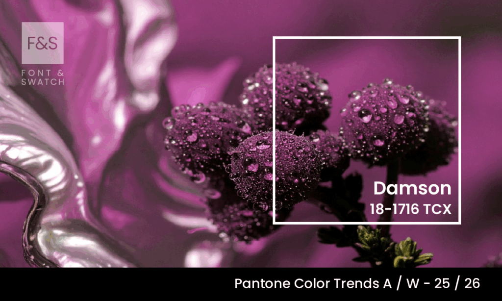
Some colours don’t just make a statement, they whisper strength, confidence, and a quiet allure. Pantone 18-1716 Damson is one such colour.
Defined by its deep purplish-red tonality, Damson evokes the ripe, luxurious skin of the ancient damson plum, offering both historical richness and modern sophistication. At Font & Swatch Branding Agency Sydney, we believe this is a colour that doesn’t compete for attention. Instead, it commands it through depth, complexity, and resonance.
What Is Damson?
Damson is a violet-red blend rooted in organic origin. The name comes directly from the damson plum, a fruit with a lineage that traces back to ancient Syria. While the colour itself is not a historical pigment per se, its tone has long been admired in textiles and visual arts, frequently appearing in dyed fabrics and oil paints that sought to convey wealth, regality, and introspective calm.
In practical terms, this colour is created by mixing red and blue pigments, often softened with hints of brown or black to mute vibrancy and introduce gravitas. This makes it distinct from more saturated purples or lighter berries, this colour has presence without flamboyance.
The Emotional Palette Of Damson
Where many bright colours shout, Damson speaks softly but meaningfully. It conjures a sense of intimacy, mystery, and elegance. Psychologically, this colour leans into introspection. It’s the tone of velvet in candlelight or of aged leather-bound journals. It feels luxurious without being over-indulgent.
Its balance between red’s intensity and violet’s restraint positions Damson as a colour of mature sophistication. It suggests quiet strength and subtle passion — ideal for branding that wants to be both trusted and remembered.
Research in colour psychology shows that deeper reds, such as those found in Damson, can stir feelings of warmth and emotional grounding. The cooler purple tones temper this passion with intellect, creating an emotionally stable hue that feels complete and confident. It is neither overwhelming nor forgettable. A rare middle ground that lends itself well to brands aiming to connect with discerning audiences.
Why Brands Should Consider Damson
At Font & Swatch, we believe Brands need to be Powerful, and this colour delivers power through subtlety. In a visual culture flooded with high contrast and neon accents, this colour cuts through by offering something deeper.
1. Luxury Without Excess: Damson has long-standing associations with royalty and high-end goods, but unlike golds or glossy blacks, it doesn’t feel performative. It feels considered. When used in packaging or branding systems, this colour projects heritage, stability, and refined taste.
2. Gender-Neutral Sophistication: While it shares lineage with wine reds and royal purples, Damson’s subdued richness makes it highly adaptable. It can be styled towards masculinity with dark woods and leathers or paired with blush tones and metallics for a more feminine or romantic effect. Its neutrality in tone allows it to flex across product categories. From spirits and luxury fashion to tech accessories and skincare.
3. Digital & Print Friendly: Colours with this level of depth often suffer in translation across digital platforms. Not so with Damson. Its slightly muted quality ensures that it reproduces well on screen, avoiding the oversaturation that can plague brighter tones. In print, it pairs beautifully with uncoated stock and metallic foils, offering textural contrast that enhances brand tactility.
4. Complementary Pairings: This colour pairs exquisitely with tones like charcoal, soft rose, muted gold, and warm greys. For contrast, it works well with natural whites like Wax Paper — offering both visual clarity and warmth. For bolder brand palettes, pairing Damson with Green Glow or Winterberry can create unexpected, compelling juxtapositions that challenge convention without losing harmony.
Strategic Use In Branding
At Font & Swatch Branding Agency Sydney, we work with brands that want more than trend—they want meaning. this colour fits beautifully into a strategic brand palette, particularly for those targeting premium markets or aiming to build trust through emotional resonance.
Consider these applications:
Brand Identity Systems: Use Damson as a base or secondary colour to create a sophisticated mood across corporate assets, web interfaces, and physical environments.
Packaging Design: Ideal for products that demand tactile richness — think skincare, fragrance, spirits, or gourmet foods. Damson elevates packaging with a quiet opulence.
Digital & UI Design: In digital spaces, Damson offers contrast without harshness. It enhances readability when paired with light typography, making it ideal for headers, banners, and backgrounds.
Boutique & Experiential Branding: Damson suits smaller, more curated experiences—whether in-store environments, hotel branding, or high-end pop-ups. It sets a mood of exclusivity without being aloof.
Final Thoughts
Brands face a choice: follow the visual noise or craft their own signal. This colour is not a fleeting trend — it’s a strategic colour that suggests control, confidence, and craftsmanship. It invites your audience to look again, linger, and connect.
At Font & Swatch Branding Agency Sydney, we help businesses create brand identities that endure. Whether you’re reimagining your visual language or building a new brand from the ground up, this colour offers a mature, emotionally resonant foundation that speaks volumes without ever raising its voice.
If your brand is ready to explore how Damson can elevate its identity, get in touch.
Because a strong Brand dominates or Disrupts its marketplace — and Damson does so with timeless authority.
Stay Ahead of Colour Trends
If you found Damson inspiring, explore more trending colours:
