Our day to day is increasingly marked by urgency, noise, and visual overload. Pantone 14-4203 Vapor Blue offers something else entirely, a quiet reprieve. It’s holds attention gently. Soft, neutral, and atmospheric, This hue evokes early morning mists and the kind of stillness that clears the mind and resets the senses.
At Font & Swatch Branding Agency Sydney, we believe powerful brands don’t always need to shout. Sometimes, they win loyalty and recognition by whispering something memorable. Vapor Blue 14-4203 is a whisperer, a soothing, silvery-blue that signals trust, sophistication, and serene intent.
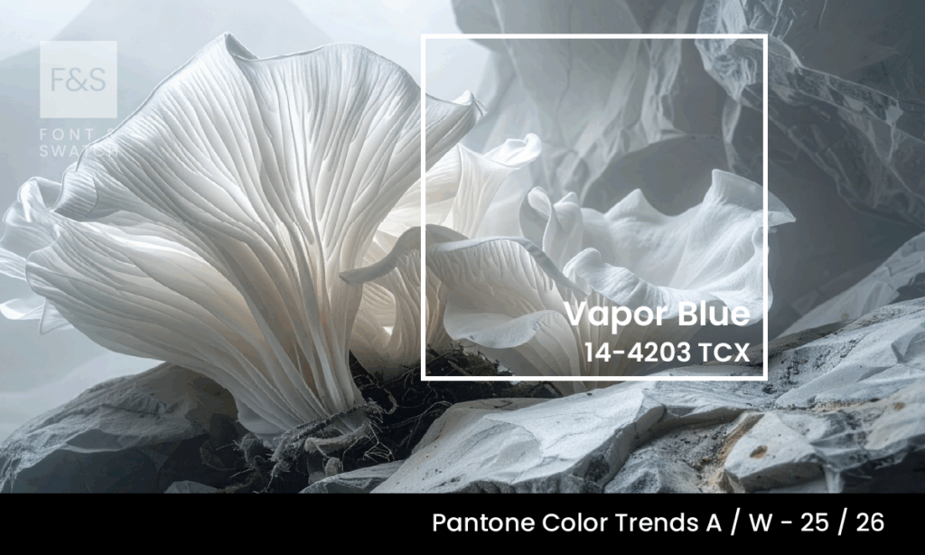
What Is Vapor Blue?
Vapor Blue is a delicate, misty blue-grey. Technically classified as a soft, desaturated blue, it carries the lightness of fog and the composure of still water. Its neutral quality makes it appear both grounded and ethereal—not common in a colour landscape often defined by binary extremes of warm vs. cool, bold vs. muted.
This is a colour inspired by atmosphere—those early moments before the sun fully breaks through, where vision is softened, sounds are dampened, and possibilities feel limitless; it captures a mood.
The Emotional Resonance Of Vapor Blue
Vapor Blue invites introspection. Its subtle nature communicates calm, restraint, and thoughtfulness. Unlike icy blues that can feel clinical or cold, This Blue has warmth through its softness, offering a space for reflection and quiet:
Calm and Composed: This is a shade that brings the pulse down, it fosters a sense of peace in both digital and physical environments, making it ideal for wellness brands, luxury interiors, and tech interfaces aiming to reduce stress or distraction.
Neutral Without Being Numb: While technically a neutral, this blue retains just enough chromatic character to be emotionally engaging. It doesn’t fade into the background, it softens the background, giving space for other elements to breathe.
Ethereal and Ephemeral: There’s a poetic quality to Vapor Blue. It evokes the intangible; breath on glass, clouds passing overhead, the way water holds light. For brands seeking to express sensitivity, nuance, or timelessness, this colour offers an elegant visual metaphor.
Strategic Use In Branding And Design
At Font & Swatch, colour is never just about aesthetics—it’s about strategy. Vapor Blue is a tone that quietly enhances credibility, clarity, and modernity. It is versatile and deeply adaptive, suitable across a wide spectrum of industries and design applications.
1. Corporate and Lifestyle Branding: Vapor Blue is a brilliant foundational colour for brands wanting to project trust, calm authority, and modern intelligence. It signals stability without feeling rigid. Think law firms breaking away from navy, fintech startups seeking maturity, or wellness brands that want clarity without cliché.
2. Digital Design: On websites and mobile apps, Vapor Blue performs beautifully as a background or UI element. It improves readability, contrasts well with darker or bolder tones, and contributes to a soothing user experience. Ideal for meditation platforms, minimalist eCommerce, or productivity tools.
3. Product Design and Packaging: Whether applied to electronics, lifestyle products, or skincare, Vapor Blue elevates perception. Its cool sophistication reads as both premium and understated. On packaging, it pairs well with uncoated papers, soft-touch finishes, and subtle metallics like brushed silver or pewter.
Colour Pairings: What Works With Vapor Blue?
Vapor Blue’s neutral character makes it exceptionally cooperative. It plays well with both warm and cool tones, creating harmony and contrast depending on the pairing.
- With Soft Neutrals: Pair with Nimbus Cloud or Bright White for a monochromatic, modern look that evokes foggy mornings and Scandinavian minimalism.
- With Natural Earth Tones: Introduce Toasted Almond or Tannin to ground Vapor Blue in warmth, lending it an organic elegance that works well in lifestyle branding or hospitality design.
- With Playful Pastels: Pair with Bubble gum Pink or Green Sheen to add freshness and subtle playfulness, ideal for beauty, fashion or youth-centric branding.
- With Contrasting Blues: Combine with deeper shades like Mykonos Blue to add depth and dimension, maintaining a cohesive palette while enhancing structure and sophistication.
Why Brands Need Vapor Blue In 2025/26
In a cultural climate seeking clarity, sustainability, and emotional intelligence, Vapor Blue offers something rare: a moment of pause. It suggests that your brand doesn’t just operate in the world—it reflects on it. It positions you as thoughtful, progressive, and composed.
As digital fatigue grows and brands search for gentler ways to connect, the emotional neutrality and visual refinement of Vapor Blue become increasingly valuable. This isn’t a colour that shouts for clicks—it earns trust, encourages return, and promotes long-term loyalty.
Final Thoughts: A Quiet Force
At Font & Swatch Branding Agency Sydney, we believe that colour has the power to shape not just perception, but behaviour. Vapor Blue is a quiet force, and emotional tempo for our times.
It offers brands a way to be modern without being cold, refined without being removed, and expressive without being excessive.
If your brand is ready to move beyond the noise and embrace an identity built on clarity, balance, and subtle strength, Vapor Blue might be the hue that helps you find your calm.
Stay Ahead of Colour Trends
If you found Vapor Blue inspiring, explore more trending colours:
