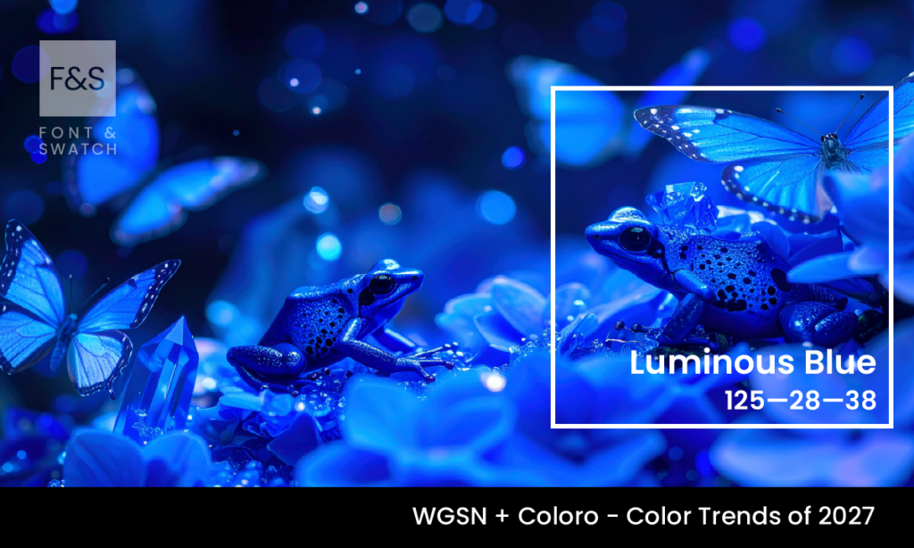
As colour trends continue to reflect broader cultural and behavioural shifts, some hues emerge not through novelty, but through relevance. Luminous Blue, named by WGSN and Coloro as the Colour of the Year for 2027, sits in that category.
It is a clear, calm mid-toned blue with a subtle radiance—neither overly saturated nor muted. What sets it apart is its balance. It carries enough brightness to feel contemporary, while maintaining a grounded quality that makes it usable across a wide range of brand applications.
At Font & Swatch Branding Agency Sydney, we see Luminous Blue as a colour that aligns with where brands are heading: towards clarity, trust, and long-term credibility.
What Is Luminous Blue?
Luminous Blue is positioned between traditional corporate blues and more expressive digital tones. It avoids the heaviness of navy and the artificiality of electric blue, instead offering a measured, light-reflective quality that feels both stable and modern.
According to WGSN and Coloro, the colour reflects a growing need for reliability and reassurance, particularly in a landscape shaped by rapid technological change and increasing division. It’s a colour that feels familiar—but not outdated.
From a technical perspective, Luminous Blue sits comfortably within the cool spectrum. Its clarity allows it to hold its form across both digital and physical applications.
Why Luminous Blue Now?
The selection of Luminous Blue is not arbitrary. It reflects broader shifts in consumer sentiment.
As digital environments become more complex and, at times, overwhelming, there is a growing preference for colours that provide visual calm and cognitive ease. Luminous Blue answers that need. It offers a sense of stability without appearing static.
There is also a strong connection to environmental themes. Blue has long been associated with water, air, and open space. In this context, Luminous Blue takes on added meaning—suggesting clarity, responsibility, and forward planning.
At Font & Swatch, we often say Brands need to be Powerful, but power isn’t just about being bold. In many cases, it comes from consistency, clarity, calmness and trust. Luminous Blue supports that approach.
What It Communicates
Luminous Blue operates on a more understated level than many trend-led colours. Its strength lies in what it implies rather than what it declares.
It suggests:
Stability and trust without feeling institutional
Clarity and openness in communication
A measured, rational approach to innovation
Calm confidence rather than overt authority
Psychologically, blue tones are known to reduce visual tension and support focus. Luminous Blue builds on this by introducing a slight luminosity, which prevents it from feeling flat or overly conservative or authoritative.
This makes it particularly effective for brands that need to communicate reliability while still appearing contemporary.
Where It Works Best
Luminous Blue is highly adaptable. Unlike more expressive colours that require careful control, this shade integrates easily into existing systems.
Digital Platforms
Luminous Blue performs well across screens. Its clarity ensures readability, while its mid-tone positioning avoids the harshness of brighter blues. It works effectively for backgrounds, UI elements, and navigation systems.
Technology and Innovation Brands
In sectors where complexity is high, colour plays an important role in simplifying perception. Luminous Blue helps present information in a way that feels accessible and structured.
Healthcare and Wellness
The calm, reassuring quality of Luminous Blue aligns naturally with industries focused on care, wellbeing, and support without being cliché or same same.
How to Use It Effectively
Like most versatile colours, Luminous Blue benefits from thoughtful application rather than overuse.
Use it as a primary brand colour where trust and clarity are central to positioning.
Pair it with neutral tones—soft greys, off-whites, or warm neutrals—to maintain balance.
Introduce contrast through darker blues or charcoal for hierarchy and structure.
Avoid combining it with overly saturated colours that compete for attention.
The goal is to let the colour create a stable foundation, rather than forcing it into a high-impact role it doesn’t need to play.
Pairing and Palette Considerations
Luminous Blue works well within restrained palettes.
When paired with warm neutrals, it creates a balanced, approachable aesthetic.
Alongside deeper blues, it builds depth without becoming heavy.
With softer colours, it reinforces environmental and sustainability narratives.
For brands looking to introduce contrast, small accents of brighter colours can be used—but with restraint.
At Font & Swatch Branding Agency, we approach colour as part of a broader system. Font & Swatch create Brand Identities that rely on cohesion, not just individual elements. Luminous Blue is a colour that supports that philosophy.
Why It Matters for Brands
Luminous Blue is not a disruptive colour in the traditional sense. It doesn’t aim to stand out through intensity or novelty. Instead, it offers something more useful: reliability in application and consistency in perception.
In a crowded market, that can be more valuable.
A strong Brand dominates or disrupts its marketplace, but disruption doesn’t always mean being louder. Sometimes it means being clearer, more consistent, and easier to engage with.
Luminous Blue enables that. It provides a visual anchor that can carry across multiple touchpoints without losing meaning.
Final Thoughts
Luminous Blue reflects a shift towards more considered branding. It aligns with businesses that prioritise clarity, trust, and long-term positioning over short-term visual impact.
It is not a colour that will suit every brand. But for organisations looking to build credibility while maintaining a contemporary presence, it offers a strong foundation.
At Font & Swatch Branding Agency Sydney, we work with businesses to develop identity systems that are both practical and enduring. Colours like Luminous Blue play an important role in that process—not as trends, but as tools.
Because ultimately, Powerful brands engage their audience through clarity, consistency, and relevance.
If your brand is ready to evolve with intention, Luminous Blue is worth serious consideration.
Stay Ahead of Colour Trends
If you found Luminous Blue inspiring, explore more trending colours:
