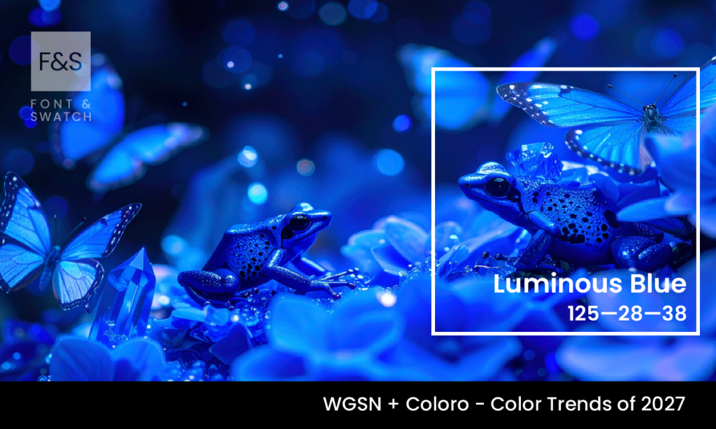
Luminous Blue: A Calm, Cool Colour Defining 2027
As colour trends continue to reflect broader cultural and behavioural shifts, some hues emerge not through novelty, but through relevance. Luminous Blue, named by WGSN and Coloro as the Colour of the Year for 2027, sits in that category. It is a clear, calm mid-toned blue with a subtle radiance—neither overly saturated nor muted. What […]
Luminous Blue: A Calm, Cool Colour Defining 2027 Read More »