Kristin Hancock | Font & Swatch | Page 3 of 8

Kristin Hancock

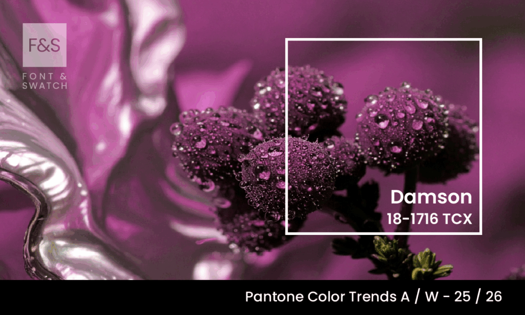
Damson Pantone 18-17-16

Damson 18-1716: A Rich, Refined Colour With Serious Depth

Some colours don’t just make a statement, they whisper strength, confidence, and a quiet allure. Pantone 18-1716 Damson is one such colour. Defined by its deep purplish-red tonality, Damson evokes the ripe, luxurious skin of the ancient damson plum, offering both historical richness and modern sophistication. At Font & Swatch Branding Agency Sydney, we believe

Damson 18-1716: A Rich, Refined Colour With Serious Depth Read More »
AI Can’t Create True Brand Identity

Can AI Really Create Your Brand Identity Or Just The Illusion Of One?

Everywhere you turn, AI is promising shortcuts. AI is only as strong as the clarity and experience you bring to it. Use it wisely and it can help you think. But ask it to define who you are and you get theatrics without truth. So, here’s the uncomfortable question no one is asking loudly enough:

Can AI Really Create Your Brand Identity Or Just The Illusion Of One? Read More »

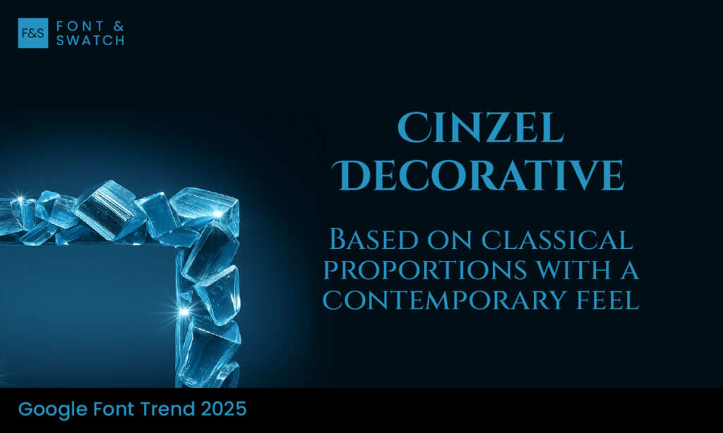
Cinzel Decorative

Cinzel Decorative: Inspired By 1st-Century Rome

Cinzel Decorative is a display typeface that draws heavily on the majesty of classical Roman inscriptions, reinterpreting ancient letterforms for modern branding. Designed by Natanael Gama and available via Google Fonts, Cinzel Decorative blends historic gravitas with decorative flourishes, giving it a distinctive voice as a headline or expression font. For brands seeking a typeface

Cinzel Decorative: Inspired By 1st-Century Rome Read More »

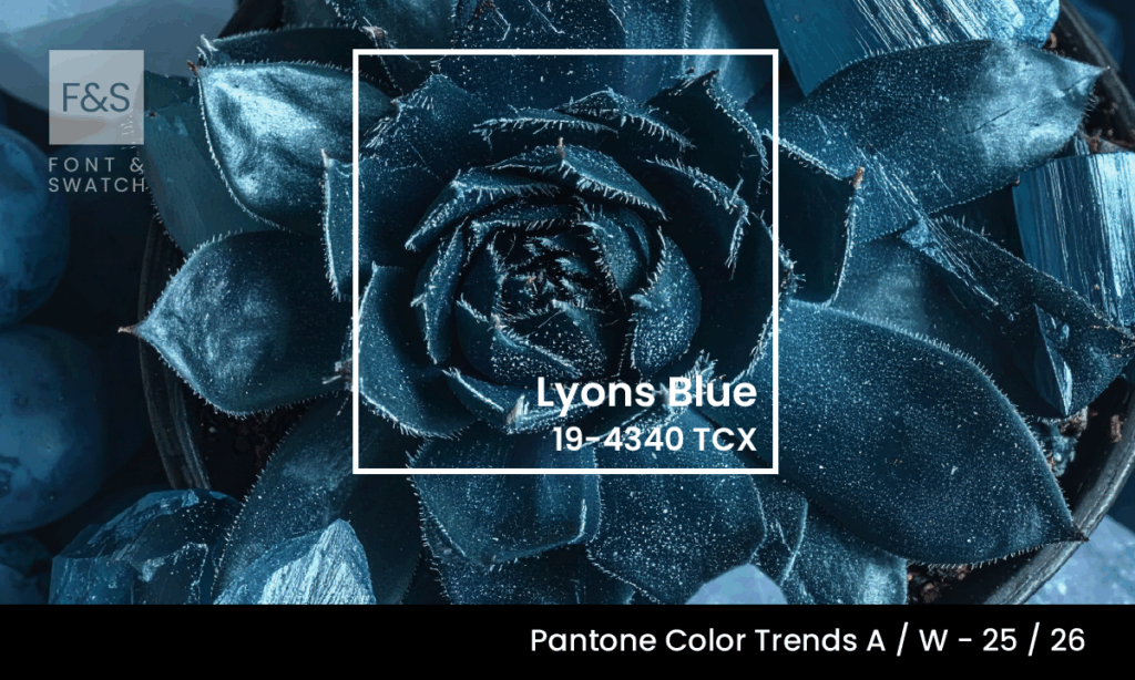
Lyons Blue Pantone 19-4340

Lyons Blue (Pantone 19-4340): A Deep Cut Of Heritage And Authority

Lyons Blue (Pantone 19-4340) is deep, reserved, and steeped in historical weight. This saturated blue evokes the grandeur of heritage . A Colour Born Of Craft And Legacy Lyons Blue, or “Bleu de Lyon” as it has been known in its French origins, harks back to the 16th-century silk trade. The city of Lyon was

Lyons Blue (Pantone 19-4340): A Deep Cut Of Heritage And Authority Read More »

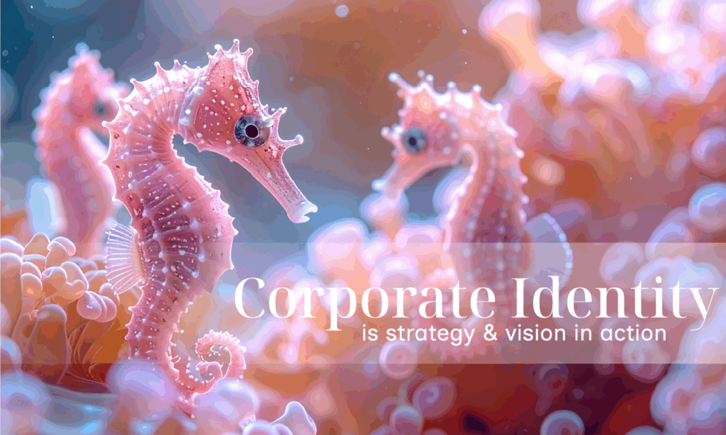
Corporate Identity Is Your Strategy, Direction and Purpose is real action

Corporate Identity: If You’re Not Owning It, Who Is?

As a CEO or Business Leader, your fingerprints are on everything that matters – the purpose, the vision, the mission, the targets and the performance metrics. Most importantly: But there’s one essential asset that often gets sidelined: Corporate Identity. Not because it doesn’t matter, but because it’s often misunderstood. Too many CEOs treat brand and

Corporate Identity: If You’re Not Owning It, Who Is? Read More »

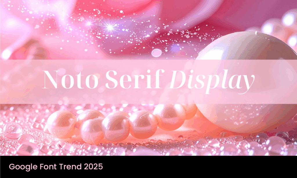
Noto Serif Display: Grace And Precision Without Tofu

Noto Serif Display is a typeface that stands out not just for its elegant form, but for the intent behind its creation. Part of Google’s expansive Noto font project, Noto Serif Display was designed specifically for large text applications—titles, headers, and anything that needs to catch the eye and hold it. It delivers a sophisticated

Noto Serif Display: Grace And Precision Without Tofu Read More »

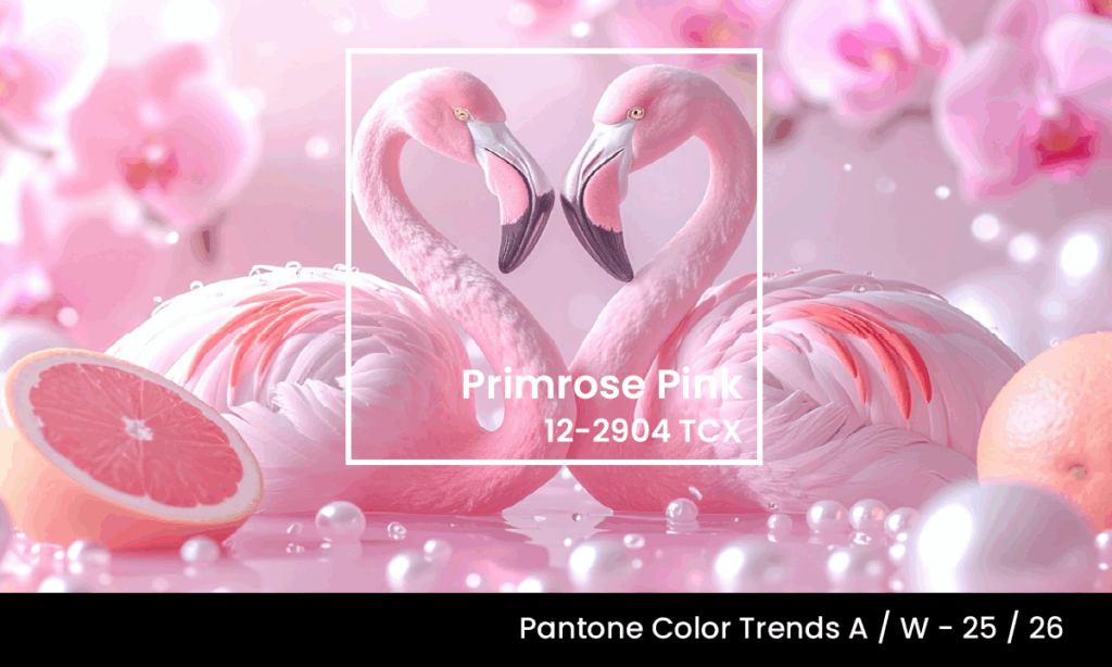
Primrose Pink Pantone 12-2904

Primrose Pink (Pantone 12-2904): Refinement And Radiance In A Colour That Connects

Soft, yet not shy. Warm, without shouting. Primrose Pink (Pantone 12-2904) is a colour that speaks in measured tones—gently illuminating, gracefully energising, and never overplaying its hand. It’s a colour of subtle power, the kind that creates its impact not by dominating, but by engaging. At Font & Swatch Branding Agency Sydney, we believe that

Primrose Pink (Pantone 12-2904): Refinement And Radiance In A Colour That Connects Read More »

Does Your Company Need An Organisational Identity

Organisational Identity: The Hidden Value Driver In Every Investment Portfolio

Fund Managers know how to assess assets from every angle. For instance: That way, your investment portfolios are in good hands. But even with all that rigour, one factor rarely makes it into the report – and yet, it often dictates whether an asset delivers on its promise. Organisational Identity (Also Known As Corporate Identity)

Organisational Identity: The Hidden Value Driver In Every Investment Portfolio Read More »

Spectral google font

Spectral Font: A Contemporary Serif Built for Digital Reading

Spectral is a Google Font designed for screen-first, content-rich environments. Created by Production Type and commissioned by Google Fonts, this font is a serif typeface that balances traditional elegance with digital performance. With seven weights, matching italics, and small caps, this type family is a workhorse for long-form reading and productivity applications. At its core,

Spectral Font: A Contemporary Serif Built for Digital Reading Read More »

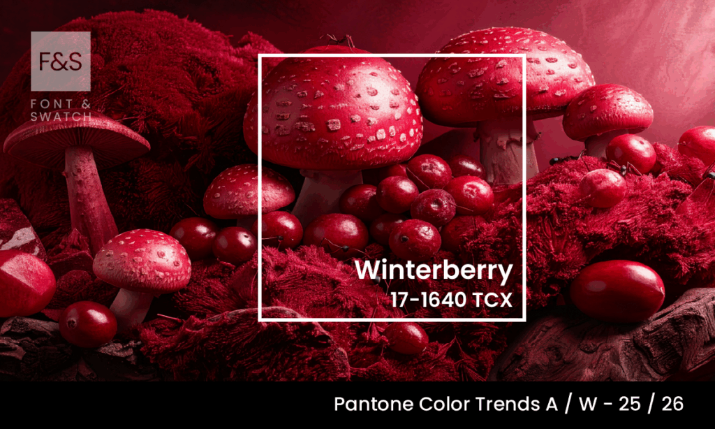
Winterberry Pantone 17-1640

Winterberry 17-1640: A Colour That Burns Warm Even In The Cold

In a season where colour often hibernates beneath frosty landscapes, Winterberry 17-1640 refuses to be muted. Bold yet romantic, assertive yet intimate—this rich pink-red lights up winter’s subdued canvas like ripe berries against snow. At Font & Swatch Branding Agency, we believe that powerful brands engage their audience—and Winterberry does so not by shouting, but

Winterberry 17-1640: A Colour That Burns Warm Even In The Cold Read More »

Would you like to chat?

Enter your information below and we will be touch

Get in Touch (#5)

First Contact: 0452 447 409
Already a Client: 0403 262 636

Sydney
Suite 4.04, 76 The Borough
76A Edinburgh Rd
Marrickville NSW 2044
Australia